How to Use Colour for Beautiful Storytelling Photos
Colour is one of the most impactful elements in photos. It can capture the mood of a moment, or a subject’s emotion. We can use it to elicit a feeling from the viewer. The choice of tones can convey personality and character, youth and fun. It can draw the eye in and lead it exactly where we want it to go.
So for all of those reasons and more, colour is one of the most powerful compositional tools for storytelling photography. But we think it’s not utilised as much as it could be – when deciding how to frame a scene or subject, we often consider all the usual rules of composition combined with our own position, but often forget to pay attention to colour.
And there are so many ways you can bring colour into your images. It can be added into a frame with the inclusion of a beautiful blue sky, fun painted walls, pretty flowers and large expanses of green grass, or fun props. In this tutorial, we’re going to show you how to incorporate colour through clothing like a boss to strengthen your storytelling photography!
Plan Ahead & Use a Colour Wheel
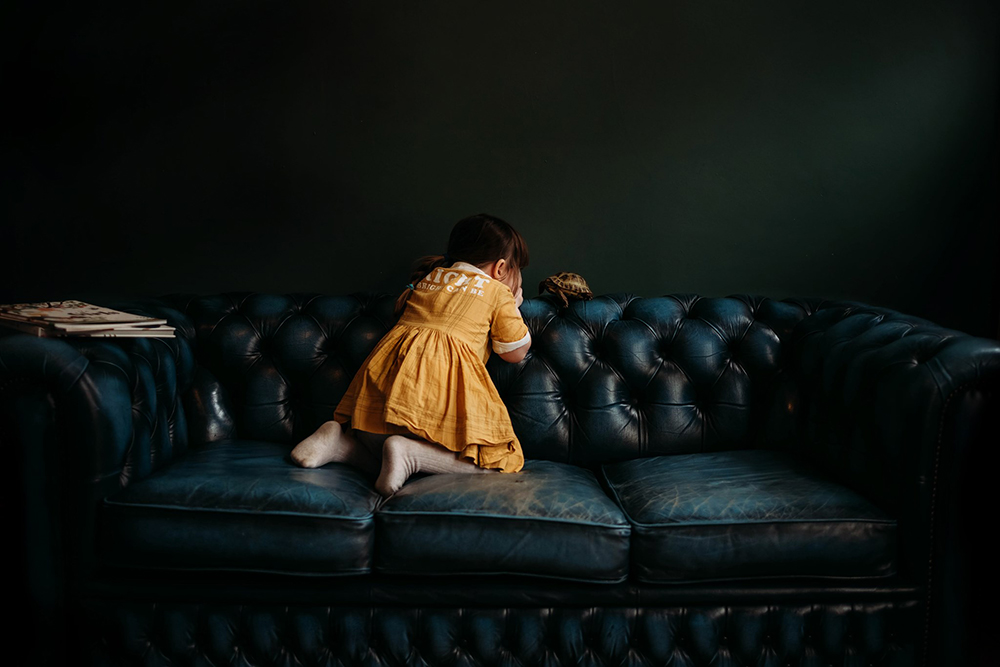
When Becca gets a vision for a photo she wants to take of her daughter Lenox, she will purposefully choose an outfit in a colour that will work with existing colours in the environment or other elements. She uses the colour wheel to help her plan a tried and true, impactful combination for an image that packs a punch!
She had a vision for this shot, and given the colour of the wall and sofa were fixed, she chose to dress Lenox in yellow. There are a few reasons why this combination works so well for this image:
- She created an analogous colour scheme – colours next to each other on the colour wheel which always look good together;
- The bright yellow helps Lenox pop against the darker tones; and
- Yellow is a warm tone which contrasts beautifull against two cool tones of green and blue.
Now I know what you’re probably thinking… what do you do if your child has very strong ideas about what they’ll wear? Well, Lenox is one of those kids. But rather than forcing her Becca works around it by giving her choices… multiple choices in yellow. So Lenox chose this dress, and everyone was happy.
Related: How to Capture Everyday Moments of Your Kids
Consider the Colours in the Environment
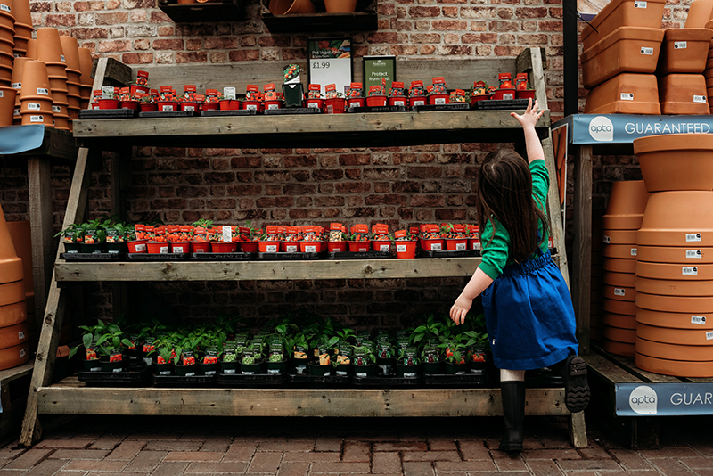
In this image below, Becca knew they were heading to a garden centre where there would be an abundance of primary colours. So she decided to dress little Lenox in two of those colors to complement the surrounds. She also chose block colours to help her pop amid this environment which would have a lot of small pops of colour which could work as competing elements.
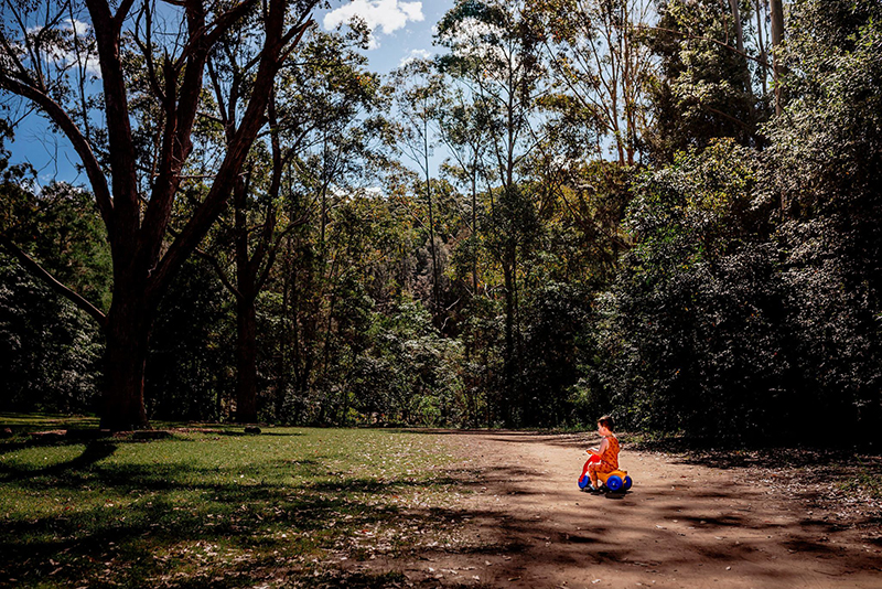
Emma planned a picnic in a National Park, where she knew there would be a lot of greenery around. So she deliberately dressed her son Mikaere in red as she knew it would pop against the green, and work well with the colours in the little motorbike he was obsessed with riding everywhere at the time.
Another way to create powerful compositions is through the use of negative space. In this photo, it works to provide a sense of scale of the environment, and highlights his tiny form in a big world. But using negative space effectively has to be purposeful. This blog post gives some fantastic tips on when and how to use it.
Related: 10 Spectacular Negative Space Photos
Everyday Moments Can Look Amazing
Your photos of your everyday moments can be amazing too. In this shot below, simply choosing a bath towel in a similarly bold but contrasting colour to Lenox’s grandmother’s top created a really striking portrait of a moment you might not normally pick up the camera for.
The other element that makes this shot work so beautifully is the light. Lenox is facing the light source at camera right, illuminating her face amidst low key surrounding light of the room and drawing the viewer in exactly where Becca wanted it to go.
Related: 18 Gorgeous Photos Using Pockets of Low Light

Working With Neutrals
If bold coloured clothing isn’t your thing, think about other ways of adding a burst of colour. In the natural environment, we can add pops of colour you’d find in nature that contrast with the location. Use the colour wheel to help you choose complementary colours (colours that are opposite one another).
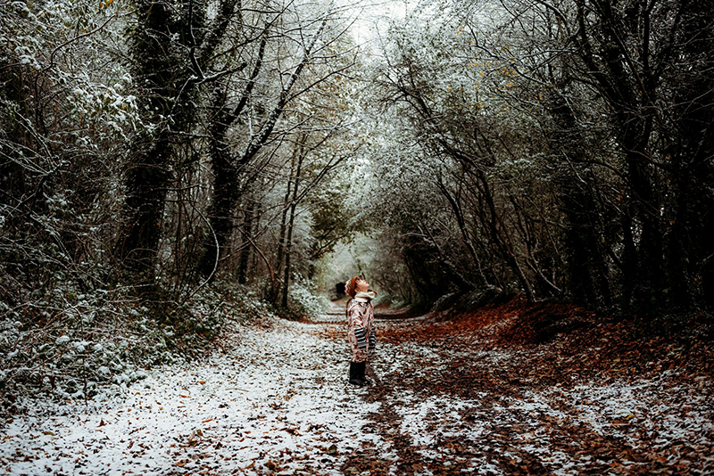
Or you could go with dark, muted tones such as navy or bottle green. This image works as an analgous colour scheme and Becca draws our eye to Lenox by dressing her in a tone much darker than the rest of the scene.
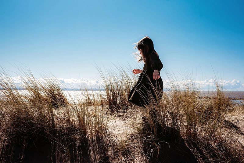
Black & White
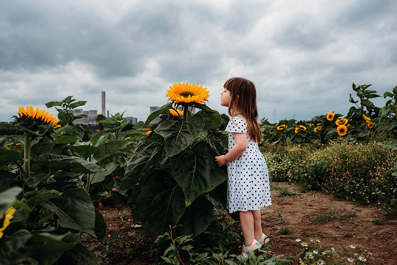
Love black & white? That’s ok, you can use it but incorporate it in a powerful way through the use of pattern. Block colours of black & white don’t tend to pop in the same way – the pattern adds interest.
Related: 8 Tips for a Stunning Sunflower Photo Session
If you’re shooting in manual mode, on our Advanced Photography Course you will develop your creative artistry, refine your skills to shoot with confidence in any scenario, and find your unique style. Our next course starts soon… to learn more and get an email when seats open, jump on the waitlist now!

Leave a Reply Cancel reply
PRIVACY POLICY & SITE TERMS AND CONDITONS
CLICK LOVE GROW ™ Pty Ltd - COPYRIGHT 2024 ©
x
Join Now
Enter your info below to join the challenge!
Want a friendly reminder when I go live?
Pop in your number and I’ll shoot you a text.
* We will send text reminders for our live calls during the challenge! Reply ‘STOP’ to end or ‘HELP’ for help.
We promise not to ever share your details with anyone or send you spam! Check our privacy policy and terms of service.
Be the first to comment