Are You Making These 5 Rookie Photographer Mistakes?
None of us were born with a camera in hand & taking awesome photos (that would be a bit weird anyway)!
We all start somewhere, and we all make mistakes when we’re learning. And since I started teaching photography back in 2013, I’ve noticed there’s a handful of mistakes being made by all beginner photographers.
Read on to discover what they are so you can learn what not to do, and take photos you love as a result!
1. Missing Focus
Picture this: You take a photo of your child, and on the LCD it looks stunning! The light is perfect, she’s looking right at you, and for a change she’s smiling beautifully (no cheese!)… that never happens! You nailed it and you can’t wait to get it on the computer so you can do some fun editing.
And when you do… you see it’s actually out of focus. Her eyes are soft, and you don’t know why. She wasn’t moving… why is it blurry?
There’s a few reasons why your photos can be out of focus, but in this instance it’s because your camera grabbed focus somewhere other than her eyes.
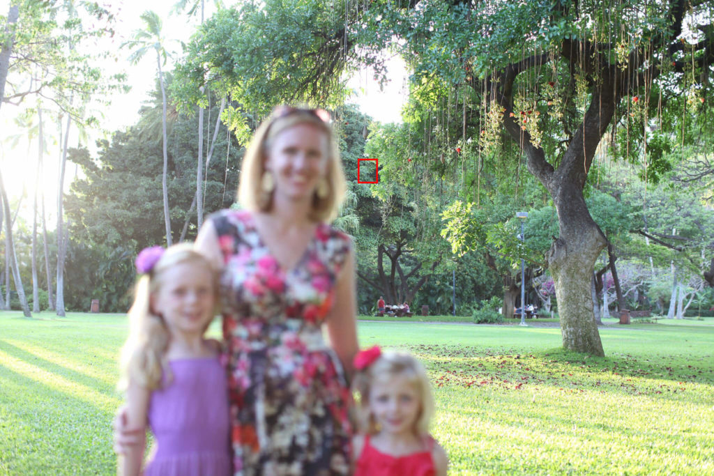
Woops! Camera grabbed the trees in the background, putting the subjects out of focus.
So how do you control focus?
When shooting in auto focus you have two options:
- Let your camera choose where it focuses; or
- You choose the focus point you want the camera to use.
The problem with the first method is your camera will focus on whatever is easiest to grab or closest to the lens, and often it’s not your subject, or it’s not their eyes. When capturing portraits, unless you tell the camera exactly where to lock focus, more often than not it will focus on your subject’s nose, or shoulder, or hat… putting their eyes out of focus.
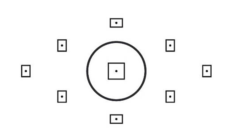
The second option gives you complete control over whether your subject’s face is blurry or in focus. Frame your shot, choose the focus point that sits over your subject’s eye, half depress the shutter to lock focus, then take the shot.
Bingo… razor sharp eyes!
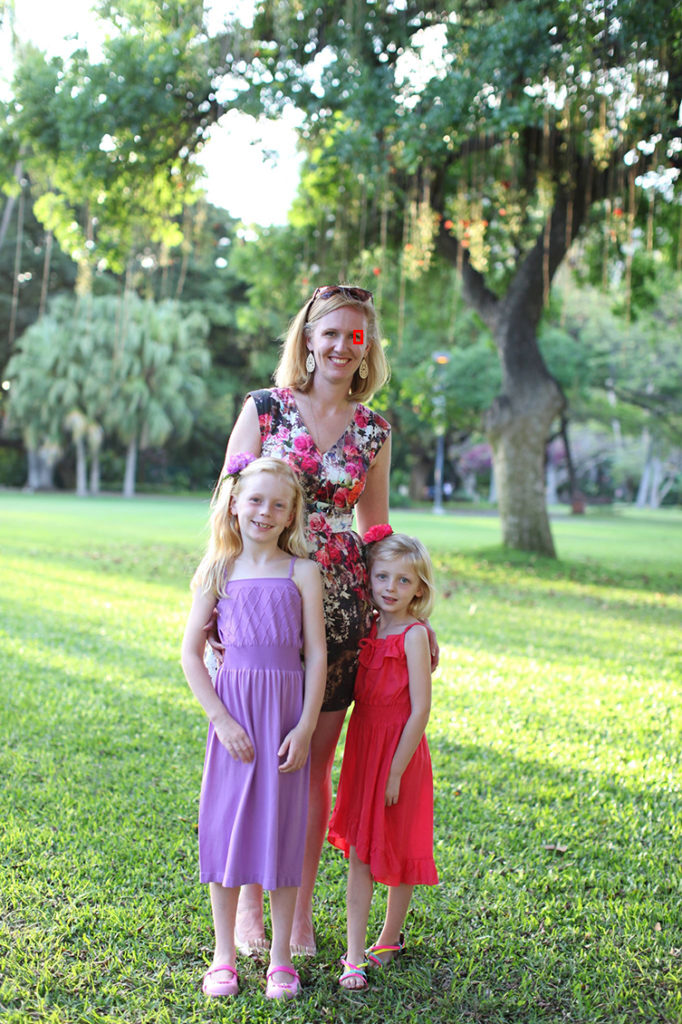
How do you choose your focus point?
You need to switch from auto focus point selection, to manual focus point selection. Then each time you frame a shot, using a button or dial on the back of your camera you will be able to toggle around the focus points you see through the viewfinder. Choose the one that sits over the spot you want to focus on, half depress the shutter to lock focus, then shoot.
Every camera model varies in terms of which buttons or dials you need to use in order to 1. switch over to manual focus point selection and 2. toggle around the focus points. Refer to your camera’s user guide to work out how.
Related: Master Your Focus
But one thing is universal regardless of your camera model – you need to be in manual mode to do it. So if you’re not, take a leap and step out of auto mode for complete and utter liberating control!
Related: Intro to Manual Mode
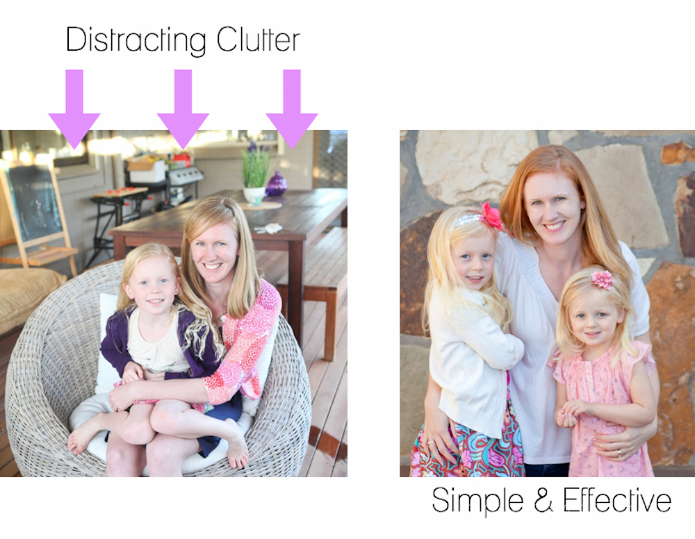
2. Not Seeing Clutter
A strong understanding of compositional theory is one of the best things you can do to elevate your photos to a professional level. That being said, often when your photo looks like a snapshot, it’s because you have clutter in the shot.
So what is clutter?
It’s that barbie on the rug, peeking into the edge of your frame. It’s a pile of newspapers on a table behind your subject, a basket of washing on the other side. Or it’s a bin just behind your subject at the local park, or a bunch of cars in the carpark, the sun glinting on the windshields (ugh!).
It’s all clutter, and it’s all forcing your subject to compete for attention. You need to learn to see it when you look through your viewfinder, and you need to clear it, move your subject, or change your shooting position!
Instantly better photos!
Related: Learn to See!
3. Blown Highlights
Something I see a lot in beginner photos is very bright light behind or near the subject and it’s really jarring!
It happens when you expose your subject properly against a background that’s much brighter than your subject, because you can only expose for your subject or the background (not both). The result is blown highlights (otherwise known as clipped) and they tend to be very distracting.
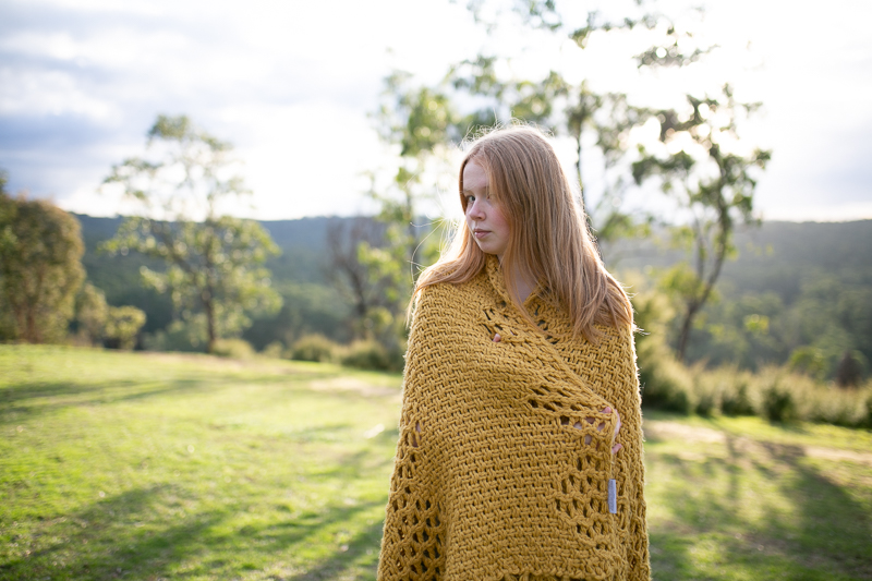
SOOC image with some blown highlights in the background. Photo: Pam Bradford, CLG Instructor
How do you know if you have blown highlights?
When you import your images into Lightroom, you can turn on the clipping warning to see if you’ve lost any detail in the highlights or shadow areas. The large expanse of red in this SOOC (straight out of camera) image shows a large portion of blown highlights.
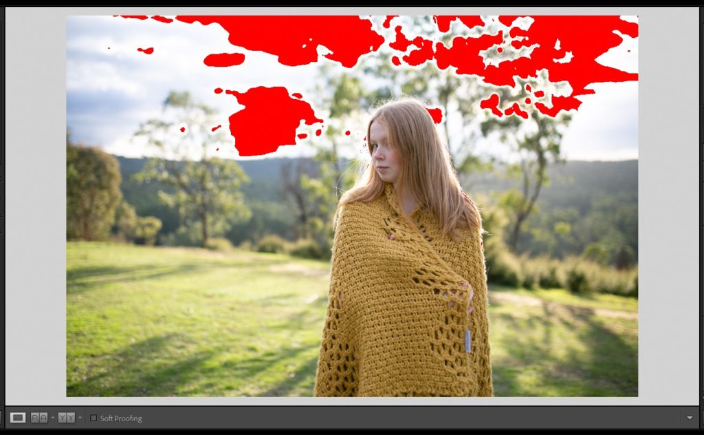
Highlight warning shows clipped highlights which mean a complete loss of irrecoverable detail.
Shoot now, fix later?
So can you fix it in processing? Nope, sorry! When you overexpose to this extent, you’ve actually missed capturing colour data in those areas, so there’s nothing to be recovered. In other words, it can’t be fixed later in post processing. You can reduce the overall brightness of the area but in doing so you won’t be capturing any detail.
This is my edited image and I used every tool at my disposal, but the best I could do was slightly reduce the impact of the blown highlights. You can see (particularly in the tree above her head) areas where there is nothing but white. That’s not light… it’s just nothingness.
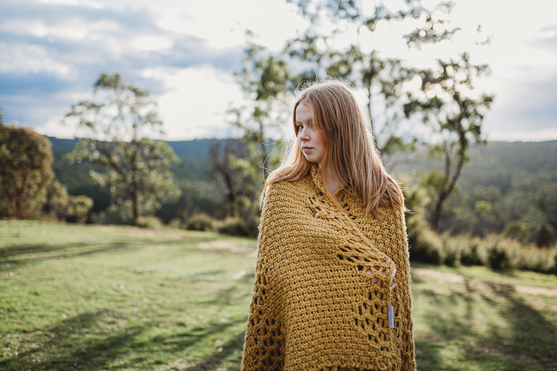
It can’t be fixed in processing.
So what can you do about it?
Get it right in camera.
With experience you’ll learn to recognise when the contrast between subject and backlight has potential for vast areas of blown highlights before you even take a shot, so you won’t settle on shooting in that spot in the first place.
But until then, turn on the highlight warning in your camera. When you take a shot, you’ll get a warning in the form of flashing colour on any areas that are going to be blown out. If it’s a very small area, you can ignore as it’s unlikely to be distracting (especially if it isn’t touching your subject). But if it’s a large area or particularly distracting for example if it’s touching your subject, move to a shadier area. Most DSLRs have this function, and you’ll find it in your menu options.
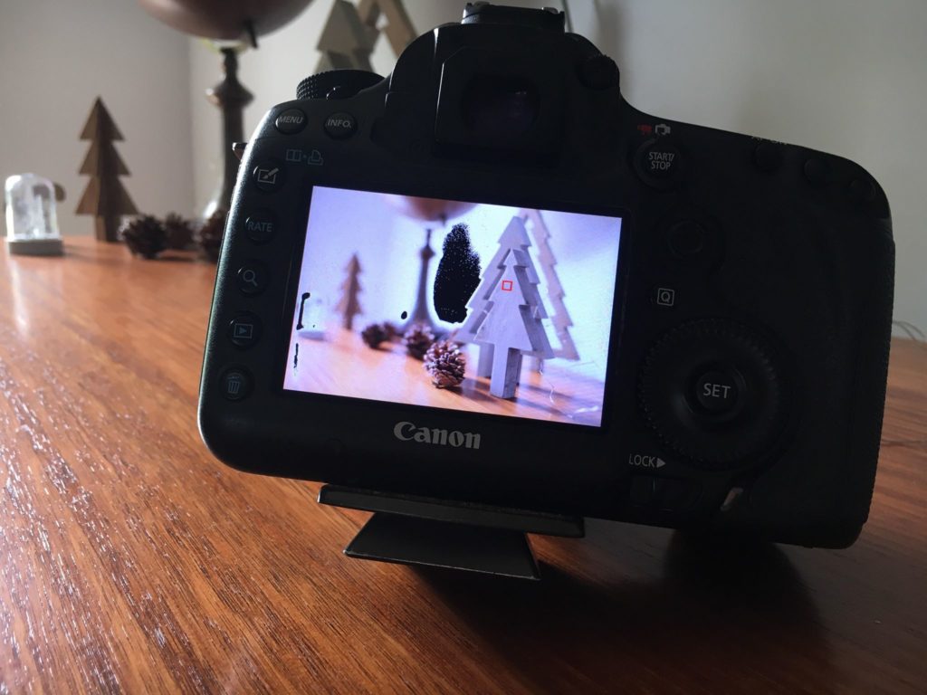
Your highlight warning is your new BFF! Photo: Pam Bradford, CLG Instructor
4. Perspective
I see this a LOT, and giving consideration to it can make huge impact on your portraits. Stop taking photos of your kids from your own standing height, all.the.time.
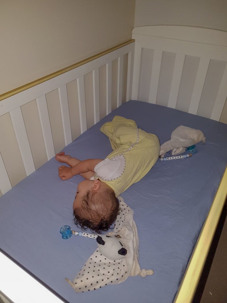
When taking photos of your kids from your standing height doesn’t work. Photo: Emma Davis
Get down low to their eye level… you’ll get a better view, it will be easier for you to engage your little subject, and your viewer will better connect with your subject.
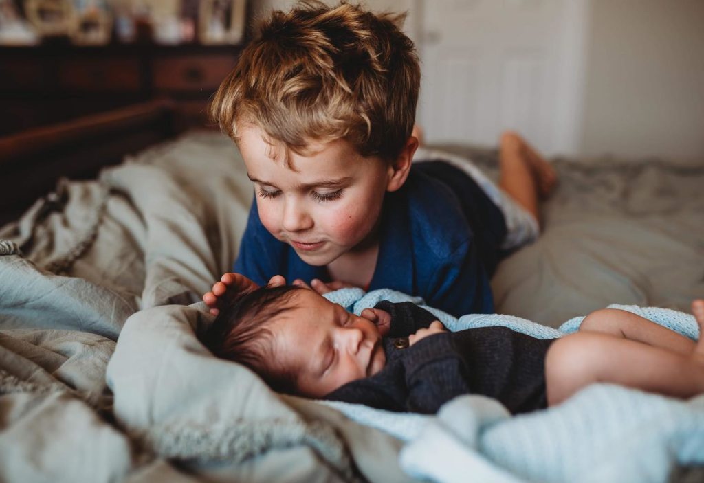
Claire Eastman, Advanced Graduate
When to shoot from above
Does that mean you should never capture kids by standing up looking down on them? No, of course not. We’re nothing if not flexible! But there’s ‘rules’ for when it works… if they’re looking up at you (which can bring beautiful light into their eyes!) is one example of when it’s ok to shoot a portrait this way. But when you do that, get in close for at least a head and shoulders shot.
Another example of when it will work is when you want a bird’s eye view of the moment or activity, or to capture a detail such as eyelashes or a whisp of hair.
Check out this article which goes into more detail on this topic, including all the ways you can make it work when shooting from above.
Related: When to Photograph Kids from Above
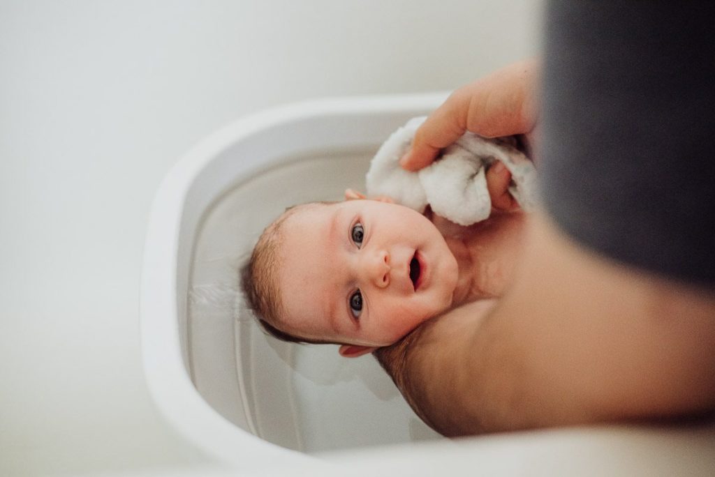
Alana Prosper, Advanced Graduate
5. Editing
I remember when I was starting out, I didn’t have the confidence to share my photos unedited. I felt like they weren’t good enough, and so to Photoshop I went for help! Soon I discovered Photoshop actions too which were the equivalent of Lightroom presets (Lightroom wasn’t even invented when I was learning!). And it’s fair to say I went a little nuts with all the tools!
It’s totally fine to edit your photos, but I see a lot of beginners over editing (just like I did!). Often it’s to either a lack of confidence in their SOOC image, or a lack of experience to “see” the subtle variations in colour, contrast, tonal range, white balance and texture to know when it’s gone too far. So instead of simply enhancing a good, out of camera shot, they create an something that’s over saturated, over contrasty, and just generally quite jarring.
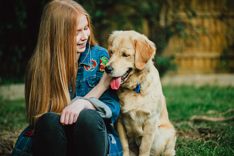
Step away from the contrast and saturation sliders! Photo: Pam Bradford, CLG Instructor
But what about personal style?
So when is it a matter of personal style and when is it… not? Maybe you think my edit of the above shot is fine, maybe you love that vibrant look. After all, beauty is in the eye of the beholder.
Look again… I took that edit into Photoshop, turned on the gamut warning, and this is what it showed me. What’s a gamut warning? It highlights colours that are out of gamut, meaning they’re saturated to the extent they can’t be reproduced in print. Small areas won’t noticed in print (and I think sometimes it’s just Photoshop being a bit pedantic). But I found out the hard way large areas of out of gamut colour will be very noticeable in print. It will look like a big blob of ink accidentally squirted on the paper.
Also look closely at her skin and compare it to the shot underneath. Her skin is quite pink especially around the creases and that’s not how she looks in real life. The increase in contrast has darkened the blacks to lose detail, and puppa’s fur is almost blown in some areas.
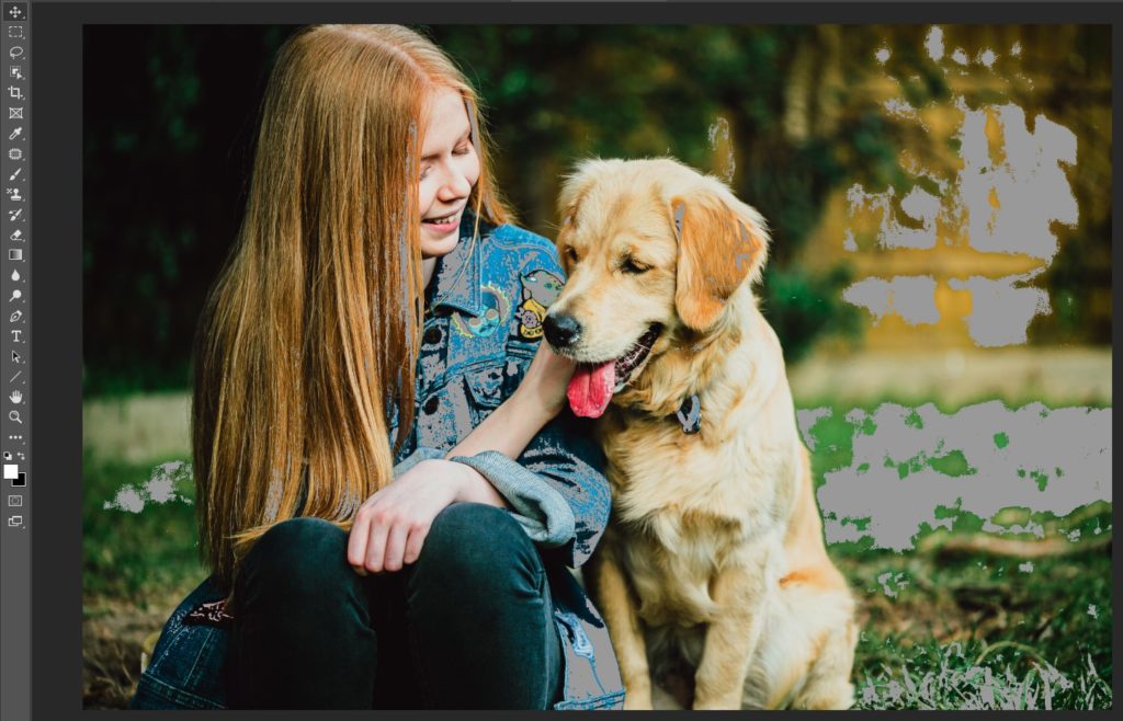
Still like this edit? Computer says nooo… check out that epic gamut warning!
So how do you know when you’ve gone too far if you haven’t developed an eye for those subtle variations?
Take it to the streets! In other words, join a photography community and ask for some constructive feedback from more seasoned photographers. If the overwhelming majority aren’t loving it, chances are you’ve gone too far with your editing.
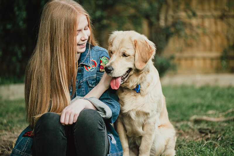
Ahh… that’s better. A little pop and contrast but not over the top, skin tones true to life and not out of gamut.
I hope you enjoyed this article and it helps you take your photos to another level! If you want to learn and be part of a positive community of photographers, join our Facebook group.
Join my new workshop and learn How to Shoot Pro-Quality Photos With Your DSLR… and it’s totally FREE to join! Register here…

Leave a Reply Cancel reply
PRIVACY POLICY & SITE TERMS AND CONDITONS
CLICK LOVE GROW ™ Pty Ltd - COPYRIGHT 2024 ©
x
Join Now
Enter your info below to join the challenge!
Want a friendly reminder when I go live?
Pop in your number and I’ll shoot you a text.
* We will send text reminders for our live calls during the challenge! Reply ‘STOP’ to end or ‘HELP’ for help.
We promise not to ever share your details with anyone or send you spam! Check our privacy policy and terms of service.
Be the first to comment