When to Break the Rule of Thirds
When to Break the Rule of Thirds
and Centre Your Subject
The rule of thirds has a lot to answer for. It’s one of the first rules of composition we all learn, along with why we shouldn’t centre our subjects.
Don’t get me wrong… there’s a reason it’s been around for a couple hundred years, it’s a fantastic tool! It helps us develop an eye for balance when we’re learning photography, so that we can mindfully create engaging and harmonious images. So it’s easy to understand why, when we’re new to photography, we would start framing absolutely everything using those handy anchor points on the rule of thirds grid!
But it’s more a guide than a rule. In some situations, centering our subject can create a more powerful composition, and the secret to doing it well is knowing why you’re doing it.
Symmetry
A harmonious image that is pleasing to the eye is such because it has balance. Often, centering our subject doesn’t work because it ignores the fact the human eye is drawn to the balance that comes from composing with the rule of thirds in mind. However, when we have symmetry around our subject or in the subject itself, we can centre our subject and the symmetry will bring balance and purpose to the composition.
There are many ways to use symmetry in our photos and when you know what to look for, you’ll be able to use it to centre your subject mindfully, confidently and with purpose to create a strong composition.
The following images are examples of symmetry in the environment or within the subject itself, which ensured the centered compositions worked..
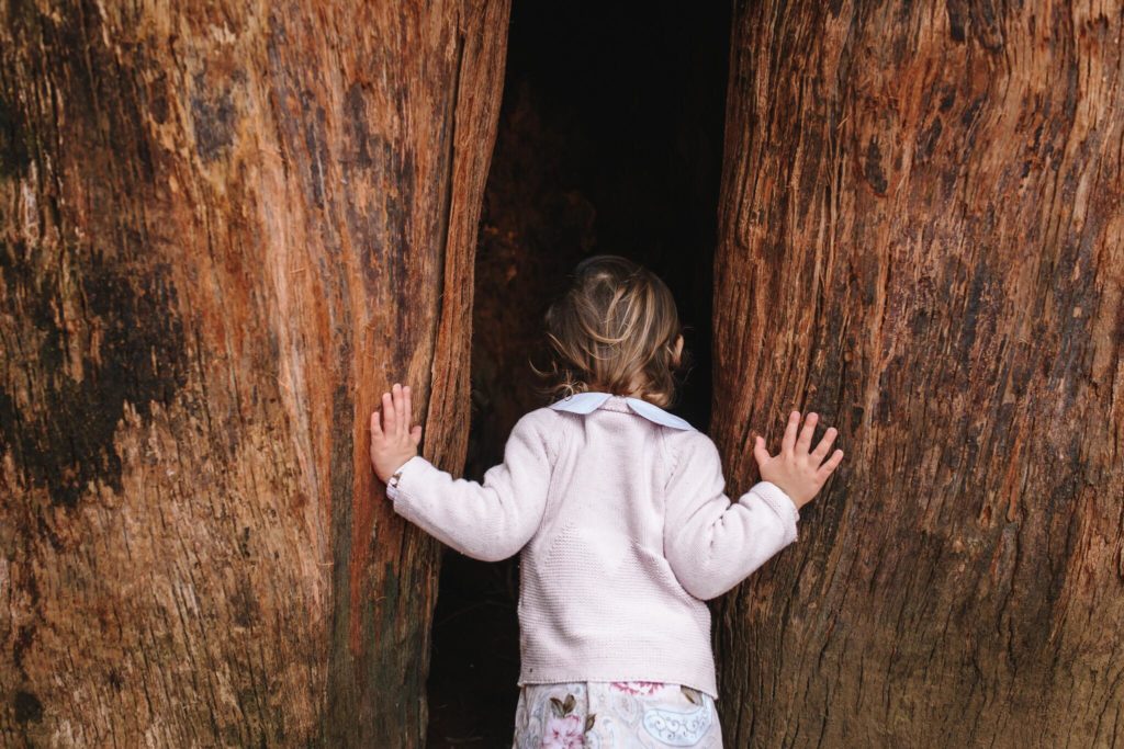
Merissa Wakefield, Click Love Grow Instructor
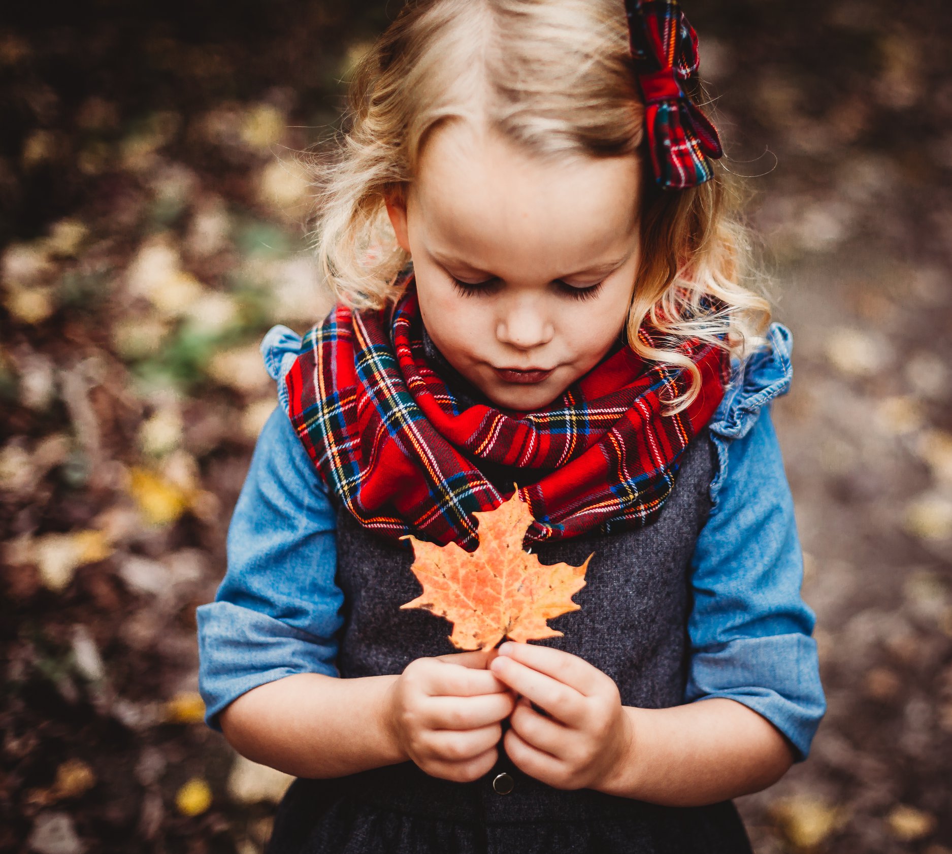
The symmetry in this shot comes from the subject herself. It’s in her front on pose, her features, the mirrored lines of her arms and hands, and the autumn leaf. Those combined elements all enable this centered portrait to work beautifully.

Kailey Nagymarosi, Click Love Grow Advanced Graduate
Another great example of symmetry in the subject, created by the mirroring of his outstretched hands, which also perfectly frame his face.

Heidi Talic, Click Love Grow Advanced Graduate
Symmetry in the environment in this instance, in the form of the bed.

Kailey Nagymarosi, Click Love Grow Advanced Graduate
Leading Lines
Leading lines can both frame our subject and lead the viewers eye in, ensuring the centered composition is meaningful.
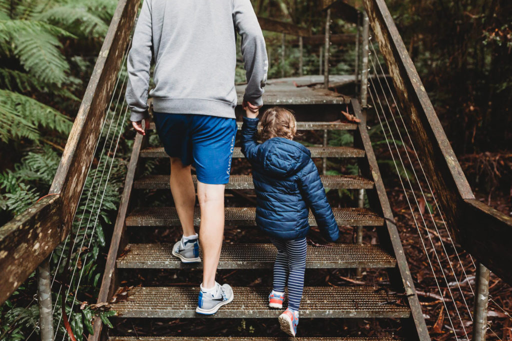
Merissa Wakefield, Click Love Grow Instructor
This family photo has its subjects smack bang in the centre, both horizontally and vertically. However, when Carla framed this image she made a few subtle decisions that went a long way to ensuring it worked beautifully.
The hand rails of the bridge work as leading lines to draw our eye to the subjects and frame them. Combine that with the low perspective, and she has created a more powerful and dynamic composition than would have been achieved had she shot it at head height, and cropped out the rails with a tighter frame.
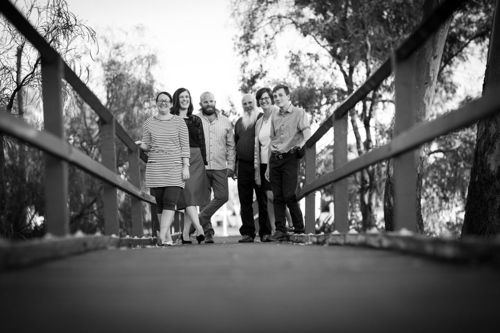
Carla Yeo, Click Love Grow Advanced Graduate
This one is a no brainer… by centering the couple (the obvious subject), Pam could include their guests, and the traditional “aisle. The latter worked as a leading line to draw the viewer’s eye to the couple and ensured it stayed there. It would be fair to say that in a scene like this, with so much going on around the couple, you couldn’t ensure they were the obvious focal point any other way.
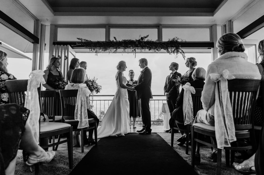
Pam Vorias, Click Love Grow Advanced Graduate
Framing
When we use objects in the environment to frame, we lead our viewer’s eye exactly where we want it to land. Therefore, centering our subject has purpose.
We can frame using nature, man made structures, or form them ourselves deliberately.
In this shot, Jesikah’s little subject is framed by the environment, in the form of scattered petals on the ground beneath her feet.
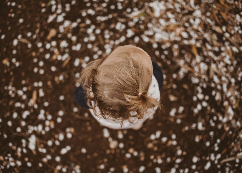
Jesikah Lee, Click Love Grow Advanced Graduate
A doorway forms the frame in this instance, and the surrounding negative space is symmetrical in form.
Related: Capturing Boys

Dana Whitley, Click Love Grow Advanced Graduate
Conversely, the furniture surrounding the subject in this shot are not symmetrical. However, the bed and the rocking chair are strong elements, similar in size and tone. Combine that with the window which provides a clean backdrop for her face amid the clutter, and we have an obvious frame for Merissa’s happy subject, giving us balance overall.
If Merissa had adjusted her position in order to place her subject using the rule of thirds, she’d have ended up with a bedhead or a chair growing out of her head, and she’d be lost in the image.
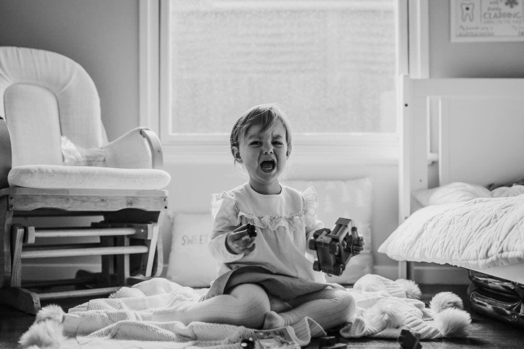
Merissa Wakefield, Click Love Grow Instructor
Perfect symmetry in the form of the architecture, providing an anchor for the asymmetrical environment surrounding the front porch.
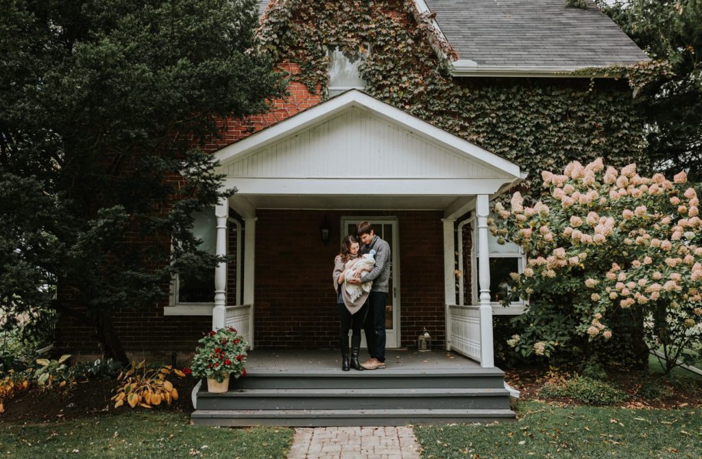
Kailey Nagymarosi, Click Love Grow Advanced Graduate
Arched gateway as frame, and symmetry is ensured through mindfully framing the elements surrounding the arch.
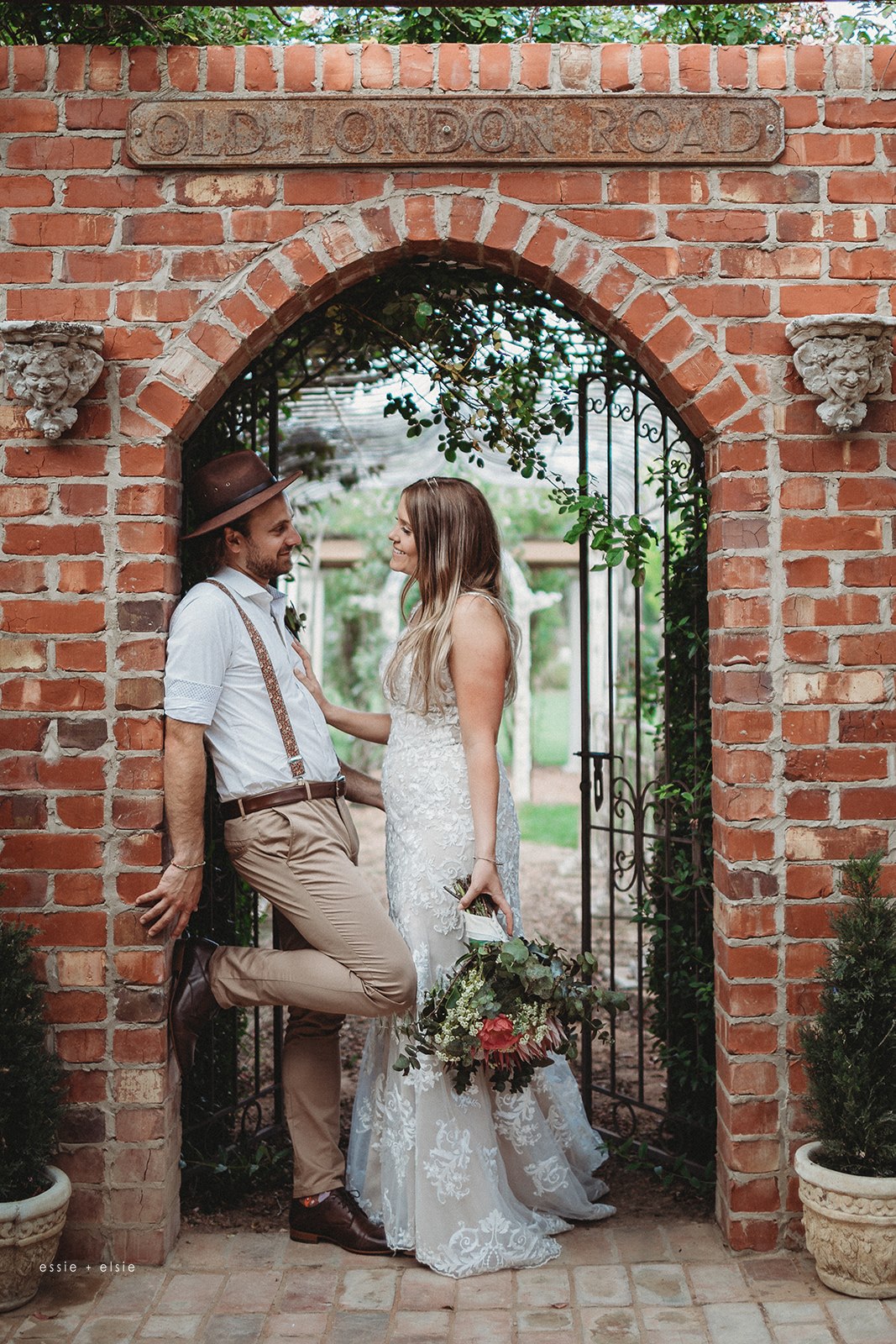
Bronwyn Pickering, Click Love Grow Advanced Graduate
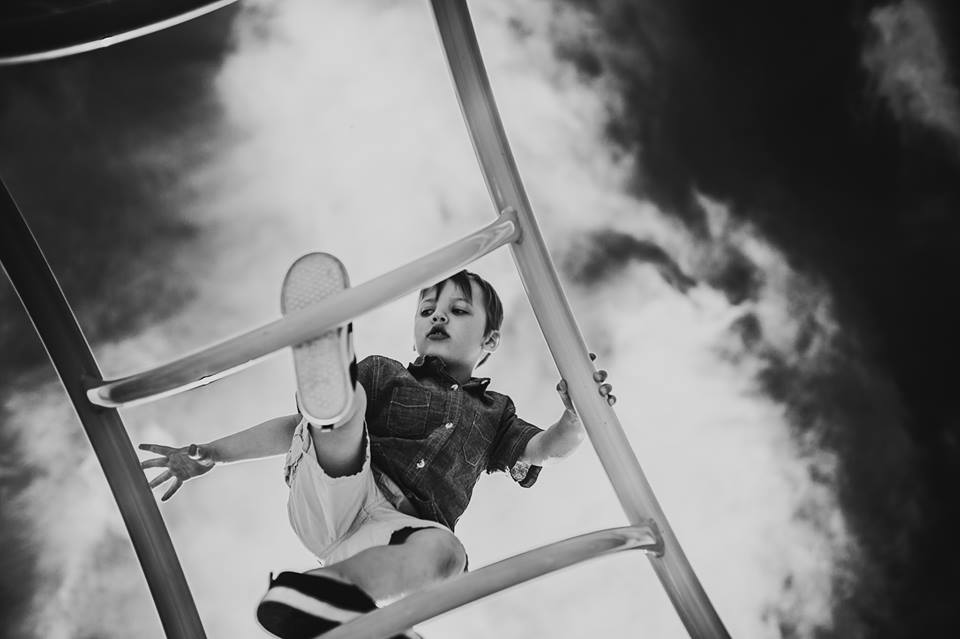
Playground equipment acts as frame here, and the sky becomes a dramatic backdrop, combining to create a really striking photo.
Kailey Nagymarosi, Click Love Grow Advanced Graduate
Negative Space
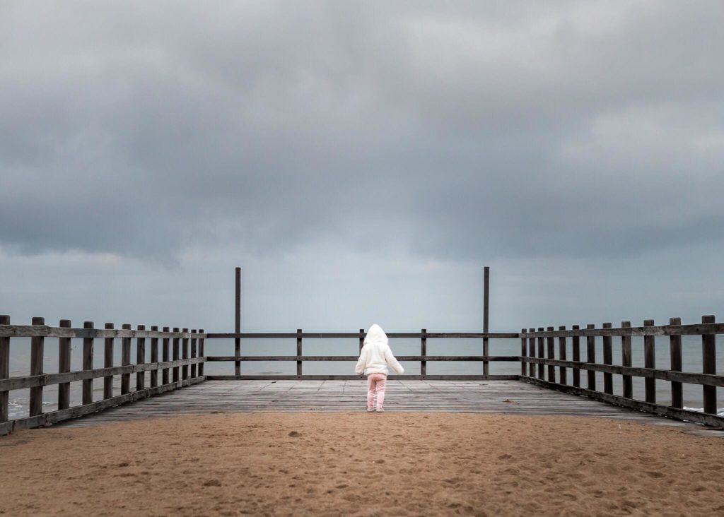
There’s actually quite a few compositional techniques going on in this shot.
The Rule of Thirds… Again
Horizontally the subject and sky are anchored using the rule of thirds, with subject placed in the bottom third, and the stormy sky taking up two thirds of the frame.
Leading Lines
The pier rails are working as leading lines to draw us into the frame.
Framing
The rails on three sides frame the subject.
Symmetry
Her mirrored outstretched arms form symmetry within the subject herself.
Lastly but most powerfully in my view, the negative space conveys a sense of her size relative to the environment and makes for a really powerful image.
With that in mind, if you removed the symmetry and framing created by the rails, this centered composition would still be a really compelling image due to the generous and purposeful use of negative space, the dramatic sky, and the symmetry created by the subject’s own form.
Merissa Wakefield, Click Love Grow Instructor
This shot is a great example of that theory… subject is centered in the frame, but it works due to the use of negative space against an incredibly striking backdrop.

Dana Whitley, Click Love Grow Advanced Graduate
Balance
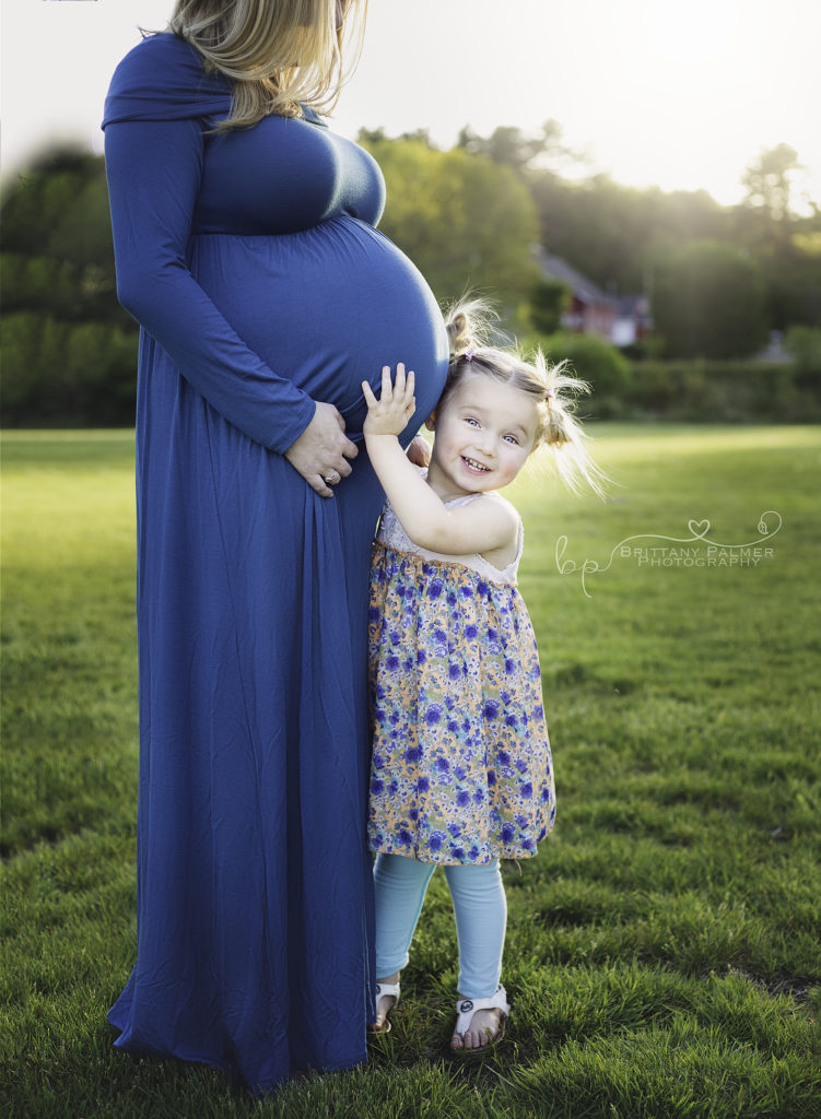
Sometimes we can’t avoid centering our subject for various reasons, and this shot is a great example of that situation.
The clear subject here is the child and her relationship with her mama’s belly, her growing sibling. Balance is provided by her mother’s form in the left of frame. Any attempt to place the girl on one of the intersecting points of the rule of thirds would have resulted in either:
- Framing too close behind her mother and adding too much unnecessary negative space on the right;
- Too much negative space behind her mother, and no negative space at all for her mother to face into.
This composition couldn’t have been framed any other way and still include both mother, child and a purposeful balance of negative space.
Also noteworthy is the fact that the girl is touching her mama’s belly connects them. It would feel disjointed and impact the balance of elements if they weren’t connected visually.
Brittany Palmer, Click Love Grow Graduate
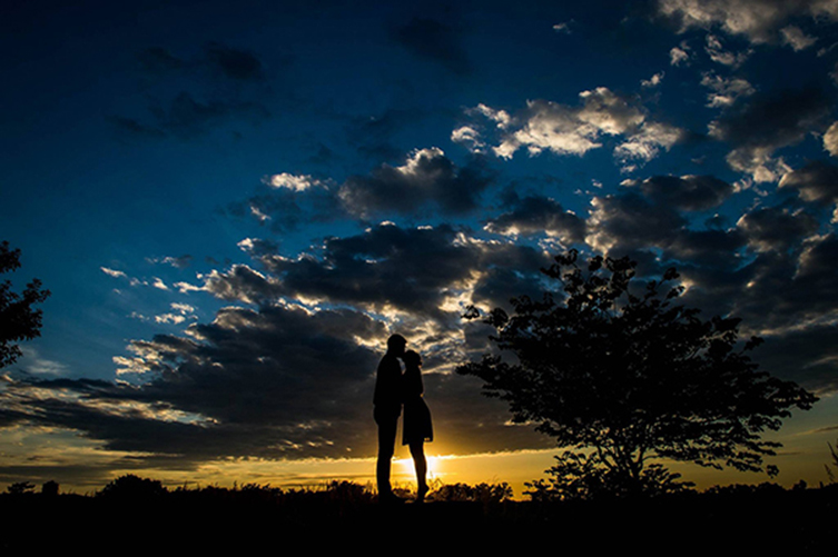
The inclusion of the tree in this shot adds interest, and frames the couple against the huge expanse of similarly toned negative space. Above all, the added element brings the rule of thirds into play whilst still allowing her to centre her subjects.
Related: How to Take a Perfect Silhouette Photo
Dana Whitley, Click Love Grow Advanced Graduate
This image works for one simple reason… the baby’s wrap trailing out to the left of frame gives a clear reason for centering the baby in the frame. As a bonus it acts as a leading line to draw us to the baby.
Related: Lifestyle Newborn Session Guide
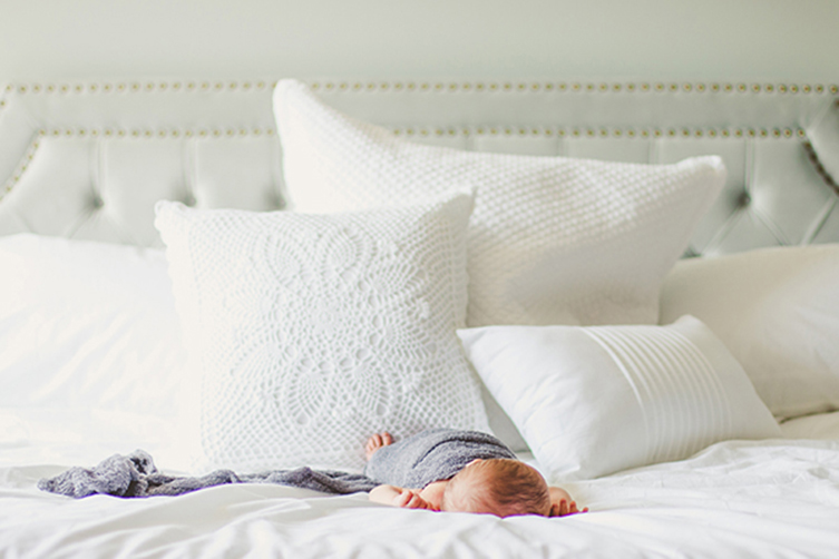
Kailey Nagymarosi, Click Love Grow Advanced Graduate
This shot has used exactly the same technique as the shot above, and the fact he’s holding on to the gate ensures a meaningful connection between the subject and that second element.
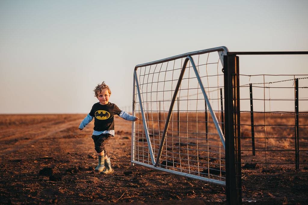
Sarah Croker, Click Love Grow Advanced Graduate
JOIN the Free 5 Day Mini Course
5 Days, 5 Videos Lessons = Photos You'll LOVE!
Learn How to Use Your DIGITAL Camera!
If you’re ready for the next steps in your photography, to level up your creative artistry, develop the skills to shoot with confidence in any scenario, and discover your style… our next Advanced Photography Course is coming in September 2022! Click HERE to get more info and reserve your spot!
Save
Leave a Reply Cancel reply
PRIVACY POLICY & SITE TERMS AND CONDITONS
CLICK LOVE GROW ™ Pty Ltd - COPYRIGHT 2024 ©
x
Join Now
Enter your info below to join the challenge!
Want a friendly reminder when I go live?
Pop in your number and I’ll shoot you a text.
* We will send text reminders for our live calls during the challenge! Reply ‘STOP’ to end or ‘HELP’ for help.
We promise not to ever share your details with anyone or send you spam! Check our privacy policy and terms of service.
Be the first to comment