5 Simple Photo Edits to Make Your Images Pop!
Have you ever looked at your photos and wondered why they look more like snapshots than polished, professional-looking images? The answer could be as easy as making a few simple photo edits to make your images really pop!
Our current Advanced Students have just finished working through their Editing lesson, and let me tell you, they have created some absolute masterpieces! Editing doesn’t have to be super complicated though – and to prove that, we’ve found a handful of great examples to illustrate 5 simple photo edits YOU can make to YOUR images TODAY to take your photos to the next level! And you don’t even need fancy editing software – all of these can easily be achieved using free editing programmes, even on your mobile phone…
1. Nail Your White Balance
White balance is the colour temperature of an image, and it’s affected by a number of elements:
- The amount of white in our frame
- The temperature of the light source we’re using; and
- Other dominant colours in the frame.
Most of us set our white balance to auto in camera, even when we’re shooting in full manual mode. It’s an easy thing to adjust in post processing, especially if you are shooting in RAW. If you’re not yet shooting in RAW, check out our handy guide to determine whether making the switch is right for you.
Related: JPG vs RAW
Below, Elaine has captured a gorgeous lifestyle portrait of her little one lying on the bed. Bub is beautifully exposed in lovely light. But rather than being true white, the wall and the quilt has taken on a muddy, slightly green tint from the temperature of the window light. Our eyes are used to seeing whites as true white, but our cameras aren’t quite as clever!
Related: What is White Balance and Why Does it Matter?

Elaine Mak, Advanced Student
In a very simple photo edit, Elaine used the temperature and tint sliders in Lightroom to adjust the white balance of her image, returning those whites to true white. Then she used a brush to adjust the white balance on bub’s face to ensure correct skin tones. The result is a lovely, clean, light and airy portrait!

2. Add A Little Contrast
Often, our images can feel a little flat straight out of camera, especially if you’re shooting in RAW. So one of the easiest tweaks you can make to give your image depth and make it pop is to give it a decent contrast boost. There are several ways to do this. The one that gives you the most control is to use the tone curve to make micro adjustments to your shadows and highlights. If your editing program doesn’t have a tone curve option, or you’re not confident using it, an even easier way is to simply shift the Contrast slider to the right. The trick is knowing just how far to push it – a l ittle goes a long way!
In this sweet capture of her son, Beth has all the elements of a stunning portrait. Gorgeous light, shadows which softly sculpt his face, catchlights in his eyes, and perfect focus and exposure. BUT it still feels a wee bit flat…
Related: 5 Rookie Photographer Mistakes

Beth Witt, Advanced Student
In her edit below, she added just the right amount of contrast to deepen the shadows and give her better separation between her subject and the background. She also played around with the Shadows and Highlights slides a little. The end result is a gorgeous image with fabulous depth.

3. Crop To Make Your Subject Pop
Another simple editing technique you can use to enhance your images is a simple crop. You don’t even need fancy editing software for this one. Most phone cameras have an inbuilt editor which allows you to crop your images. Just be aware that cropping does reduce the overall pixel size of your image, so if you crop too much, you can end up with noticeably reduced quality.
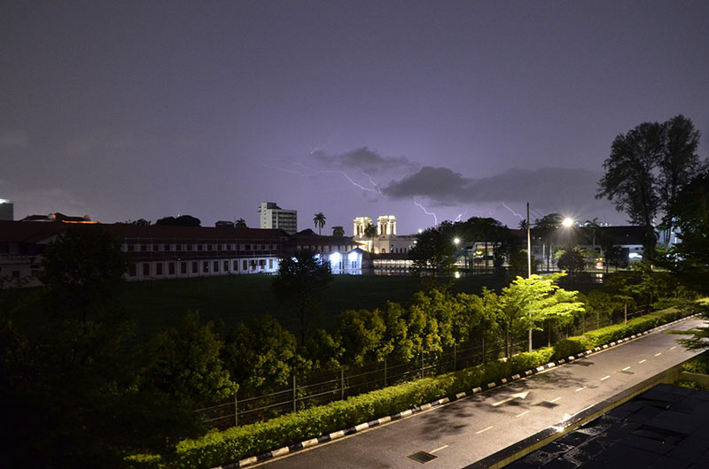
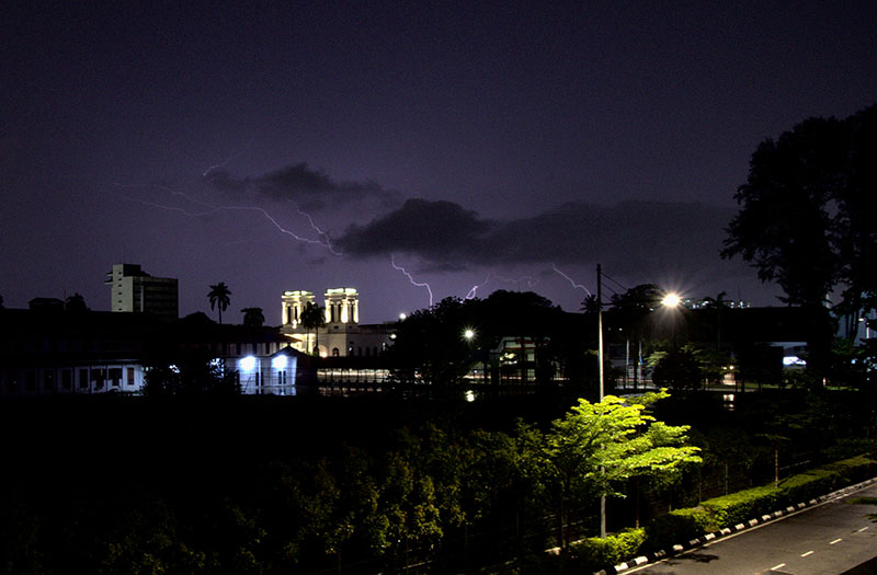
It’s always a good idea to get your composition as close to perfect as possible in camera. But sometimes our positioning, our gear or a combination of both limits us. In the below image, Kathleen wanted to capture the fantastic lightning display during a recent storm. But she needed to stay in a spot where she was protected from the weather. So this meant shooting a little wider than she would have liked.
Related: Travel and Landscape Photography
Kathleen Beu, Advanced Student
By cropping in tighter to remove some of the foreground elements, Kathleen eliminated the distracting light near the bottom of the frame. She also draws the viewer closer to that glorious lightening display and all the detail in the buildings. She’s rendered the street lights into gorgeous starbursts by shooting with a narrow aperture. And lastly she added contrast to deepen the blacks and make that sky really pop.
Related: How to Take Starburst Photos
4. Clone To Clear The Clutter
The easiest way to take your image from a snapshot to a professional-looking photo is to clear background clutter! Obviously, it’s much easier to do this in-camera by clearing away any distractions before you take the shot. But sometimes, in the time it takes to do that, you’ll miss the moment. Especially if your subject is a busy little one!
So if you can’t clear the clutter before you take the photo, the next best thing is to clone it out through editing!
In the image below, Advanced Student Allison Reilly has captured a sweet moment in the backyard with her daughter. The light is lovely and soft, she has gorgeous catchlights in her eyes, but… she’s surrounded by the usual backyard clutter! If Allison had stopped to move the bikes, or asked her daughter to move to a less cluttered spot, she would have lost the spontaneity.
Related: How to Get Sparkly Eyes

Allison Reilly, Advanced Student
So instead, Allison has chosen to clear the clutter using editing tools. She started by cropping in tight to eliminate as much clutter as possible. This in turn placed her daughter’s eyes on the top rule of thirds line for a stronger composition. Then she used the clone and heal tools to remove the remaining distractions. In this case, Allison has used the grass to cover and blend in unwanted marks, blemishes and objects.
If you look closely, you’ll see Allison has also used these tools to clean some dirty marks on her daughter’s face. The result is a gorgeous lifestyle portrait just begging to be framed!
Related: Using The Rule of Thirds

5. Straighten That Horizon
If you’ve never noticed a crooked horizon line before, you won’t be able to unsee them now that I’ve pointed it out! It’s such a simple adjustment to make, but it makes such a HUGE difference to your finished image! As with all things, ideally, this is one we want to get right in camera. But balancing your camera 100% straight is a lot more challenging than it sounds! Especially when you’re trying to capture fast motion!
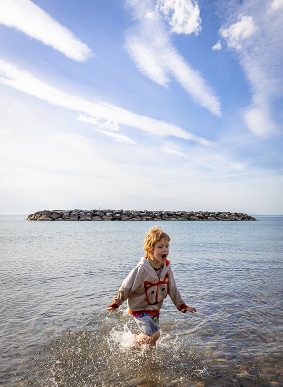
In this fun beach image below, Elizabeth has captured a lovely, spontaneous moment with a great expression. But the overall scene is on a lean and her subject appears to be running uphill because her horizon line is crooked.

Elizabeth Raible, Advanced Student
In her edit below, Elizabeth has straightened the horizon line perfectly, giving her frame a much more balanced feel. She also lifted the shadows to brighten her subject and added contrast and vibrance to emphasise the glorious sky.
Related: Six Backlight Photo Ideas To Try
So there you have it! Easy tweaks in the form of 5 simple photo edits you can make to your images RIGHT NOW to take your photographs to the next level!
Not sure how to use some of the tools we’ve talked about in this post? In the quick video below, CLG Instructor Emma Davis shows you how to use Lightroom to:
- Adjust your white balance
- Determine if your subject’s skin tones are on point
- Clone out spots and blemishes; and
- Use the Contrast, Shadows and Highlights sliders to give your images depth!
Free Photography Workshop
Join my new workshop and learn How to Shoot Pro-Quality Photos With Your DSLR… and it’s totally FREE to join! Register here…

Leave a Reply Cancel reply
PRIVACY POLICY & SITE TERMS AND CONDITONS
CLICK LOVE GROW ™ Pty Ltd - COPYRIGHT 2024 ©
x
Join Now
Enter your info below to join the challenge!
Want a friendly reminder when I go live?
Pop in your number and I’ll shoot you a text.
* We will send text reminders for our live calls during the challenge! Reply ‘STOP’ to end or ‘HELP’ for help.
We promise not to ever share your details with anyone or send you spam! Check our privacy policy and terms of service.
Be the first to comment