Black & White Street Photography
When it comes to street photography, the very nature of it means the backdrop is often very busy. But that’s ok because often the entire scene is your subject matter.
But when you want to highlight something specific, it can be hard to isolate it from the many distractions in the surrounding environment. Times like that, converting to B&W – or even shooting intentionally to create a monochrome image from the outset – is the answer.
So today we wanted to share some fabulous street images that used a monochrome palette to isolate, highlight, or simply to turn a blah image into something special! Read on to be inspired to pick up your camera and head out with the express intention of shooting for a B&W series of street images…
Isolate Your Subject
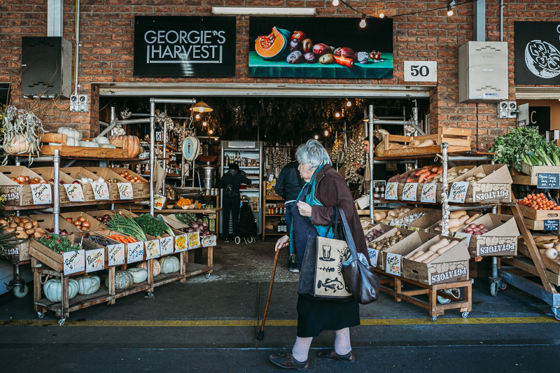
There was a lot of colour in the produce in this scene, and for that reason the original colour image looks vibrant and appealing, with a strong storytelling element, and I love it for all that detail.
Pam Bradford, CLG Instructor
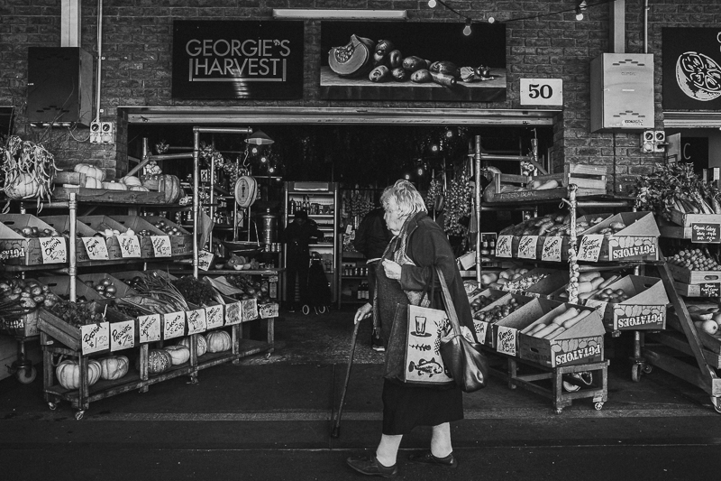
But I also wanted to create a different version, one that draws the viewer’s eye to the shopper walking past, and leads them to wonder about her. What’s her story… is this her local? Does she come every Friday? How does she get there? Does she live around the corner? Has she been coming to this market her entire adult life? Is she planning a family feast tonight? What will she cook?
I had waited aaages in this spot, just for someone interesting to walk past that I could frame in the doorway and add a sense of movement and life to the scene. Side note: waiting is a key feature of street photography! But more on that later…
In this B&W conversion she stands out more and the eye goes directly to her. In the colour version, the action going on inside the store is more prevalent too. But in this edit, that detail is muted enough that we barely notice them.
Related: 5 Inspiring Ideas for a B&W Photo Series
Pam Bradford, CLG Instructor
Texture
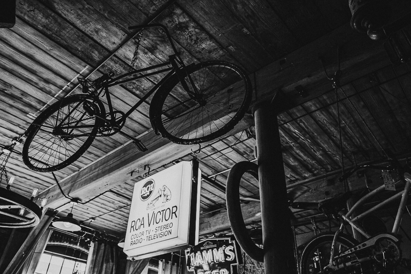
I love the colour original of this scene too – it’s warm and the tonal range is beautiful. But what I loved most when I looked up was the beautifully textured ceiling of this building, and in colour it was a little too busy to notice. In b&w, I loved the shot even more.
Related: Capturing Mood in Monochrome
Pam Bradford, CLG Instructor
Pattern & Detail
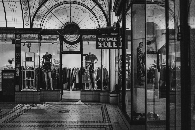
When I entered the Cathedral Arcade in Central Melbourne, it was the art deco details that caught my eye. I love the strong pattern of the tiles and the detail in the curved windows above. I also love that it’s all reflected in the windows on the right, adding extra depth. And all of that was much more noticeable without the distraction of the lights and bold colours of the clothing in the store window displays.
Pam Bradford, CLG Instructor
Underexposed & Grainy
When I shot this, it was late at night and I was walking past. It was dark inside and even with an ISO of 3200 it was still underexposed. And I’m a bit old school – I refuse to upgrade from my 8 year old Canon 5d Mk3, and 3200 is about as far as I can comfortably push my ISO before I start to lose too much detail in the shadows. This is the SOOC and a little too dark in the details for me.
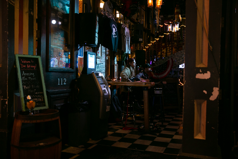
Pam Bradford, CLG Instructor – sooc f/2.8, SS 1/100, ISO 4000
But when I increase exposure and try to edit, it feels muddy, over contrasty, the colours are saturated (not in the good way!), white balance and tone is off, and it brought out too much orange in the ambient light. It hurts my eyes! I could probably fix it all… if I spent a lot of time and energy and agonised over it! But a quick conversion to B&W and I like it a lot better.
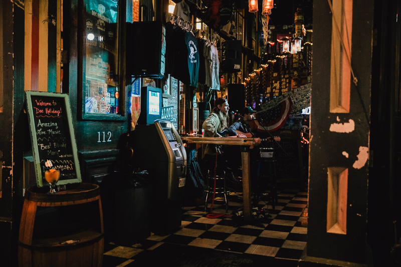
Pam Bradford, CLG Instructor – colour edit (ouch!)
A much easier edit in B&W, and I think the chequered floor which caught my eye to begin with, stands out more. It also highlights all the different textures and elements lining the walls.
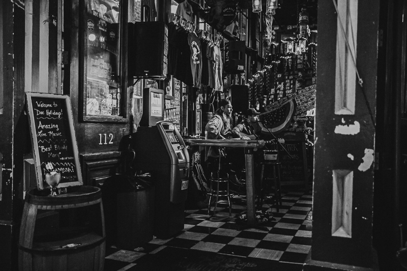
Pam Bradford, CLG Instructor – easy B&W conversion, much better!
Blah to Wow
Some photos just look a bit blah. Maybe you couldn’t translate what you were seeing, the thing that caught your eye in the first place. Maybe it was a vibe, which is hard to communicate in an image. Whatever the reason, it happens. But sometimes an image can be a bit meh, then you convert to B&W and without even a tweak it’s immediately a bit holy wow! Try it!
What caught my eye here was 1. I love stand up comedy (the Melbourne comedy festival is my fave festival); 2. We had been in Covid lockdown for eleventy hundred years; and 3. As a result, that signage was a juxtoposition of reality. There was no comedy. There hadn’t been comedy for a long time. There was no comedy coming in the forseeable future.
But in colour, this image felt a bit blah. I took it with my Lensbaby Sweet 35 and I loved the movement, but it felt like there was too much going on in the background to really draw the eye to that sign.
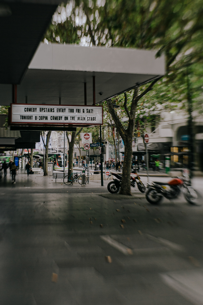
Pam Bradford, CLG Instructor
But I persisted with it because for me it’s a storytelling image that shares a little about me. Converted it and voila, in black & white I achieved my vision. Also, check out that oval bokeh!
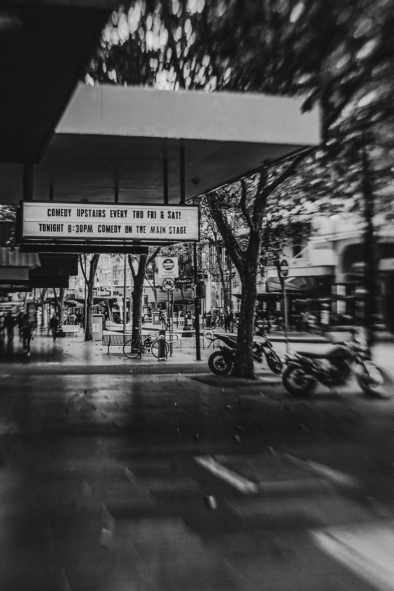
Pam Bradford, CLG Instructor
Signage as Subject
Speaking of signage… These two shots were taken by Almitra Hill, one of our Advanced Grads and a regular workshop host. Almitra loves to look for interesting signage to incorporate into her shots. When she finds one that takes her fancy, she’ll wait for some kind of action or interest to unfold in front of it.
Street photographers will tell you it’s not uncommon to come home from a day’s shooting with only one shot you really love. This is a frustrating aspect of street photography and it happens because there’s so much going on, sometimes you just can’t get a clear shot. Other times no one interesting walks into your frame. But when you get that one shot it’s a huge thrill and totally worth the effort, and it’s what keeps you coming back for more.
If you’re a local, perhaps you can return to the same location if you don’t come up with anything on your first attempt.
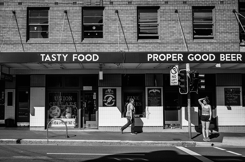
Almitra Hill, CLG Advanced Grad
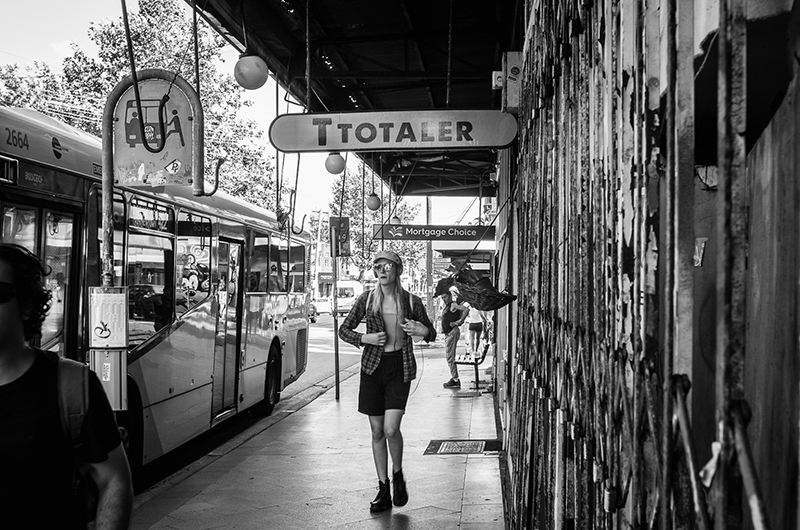
Almitra Hill, CLG Advanced Grad
Reflections
Another favourite shot type for street photographers is capturing their own reflection, and Almitra is no exception. These types of shots are often best converted to B&W because a reflection shot can be confused by detail moreso than any other kind of shot. By removing the colour you can minimise the distractions and highlight the details.
Speaking to this image specifically, in colour the detail in the bricks and signage would be more prevalent, and it would steer our eye away from the man in the hat walking past. We might not even have noticed him.
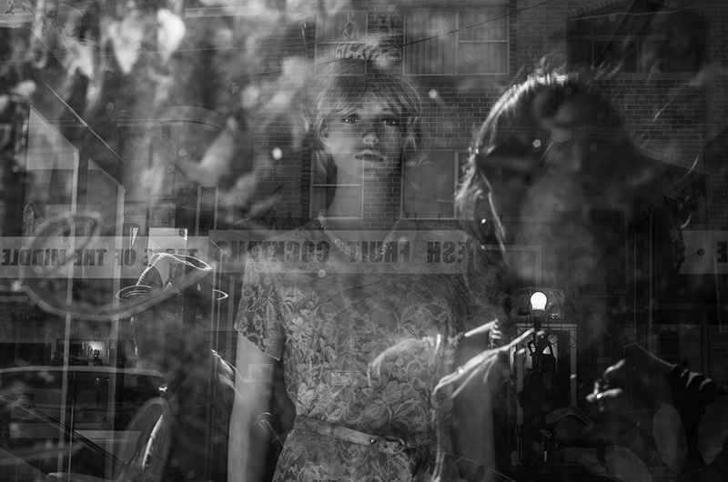
Almitra Hill, CLG Advanced Grad
Top Tips for Street Photography
Travel Light & Easy
There’s lots of walking with street photography, so you want to be comfortable. I have a small camera backpack with just enough room for my camera, one lens, phone, keys, wallet and a small water bottle. And for that reason, I only ever bring one lens, so I make sure it’s the most versatile lens I own.
Speaking of lenses…
Focal Length
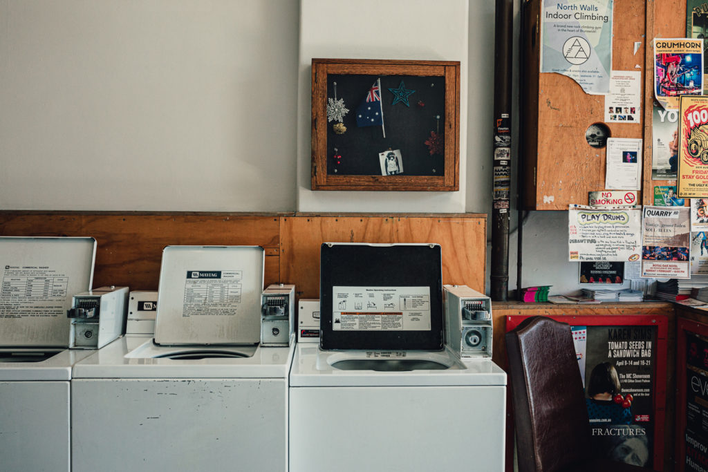
Traditionally street photographers shoot with a 35mm prime lens (or equivalent). In fact some purists will tell you it’s the only way! I personally use my 24-70mm as sometimes I like to walk into interesting stores or buildings and shoot inside, and I’ve been caught short a few times when 35mm wasn’t quite wide enough.
The day I took this shot inside a laundromat in Brunswick, Melbourne, I only had my 35mm with me. I had to push back against the wall as much as I could in order to get this shot, and I would have liked to include more but I couldn’t. After this day I always brought my 24-70mm instead.
Related: What Lens Should I Use
Aperture
Unless I really want to isolate a small detail, I tend to shoot at around f/6.3 to f/7.1 If I’m pushed for light, I’ll open up to f/5.6 if I can’t avoid it. Beyond that I’d prefer to push my ISO or slow down my shutter speed. Having that deeper depth of field also gives you some wiggle room if something or someone interesting enters the scene unexpectedly.
Shutter Speed
Purists will tell you true street photography always contains people, and never posed. I call rubbish on that… some days I’m just not feeling confident enough. When that happens I shoot what I’d call urban landscapes. But it’s always my preference to include people in my frame. They add life, movement, colour, interest, an extra layer to the scene. You can use them as an interesting juxtaposition against signage, to make a statement or purely for the humour value. For that reason I always try to keep my shutter speed sitting at least 1/320 so that when I’m lucky enough to get something walking into my frame, I can freeze their motion.
Capturing Motion
That being said, capturing motion is totally ok too… it adds even more movement and conveys the sense of energy we get in the city. Just make sure that motion appears intentional. A little blur can look accidental, too much can render the subject unrecognisable. Sadly there’s no one size fits all shutter speed, because the speed of motion of your subject is not universal. So find your perfect balance of blur by experimenting with shutter speed – around 1/100 would be a good starting point.
Be Patient
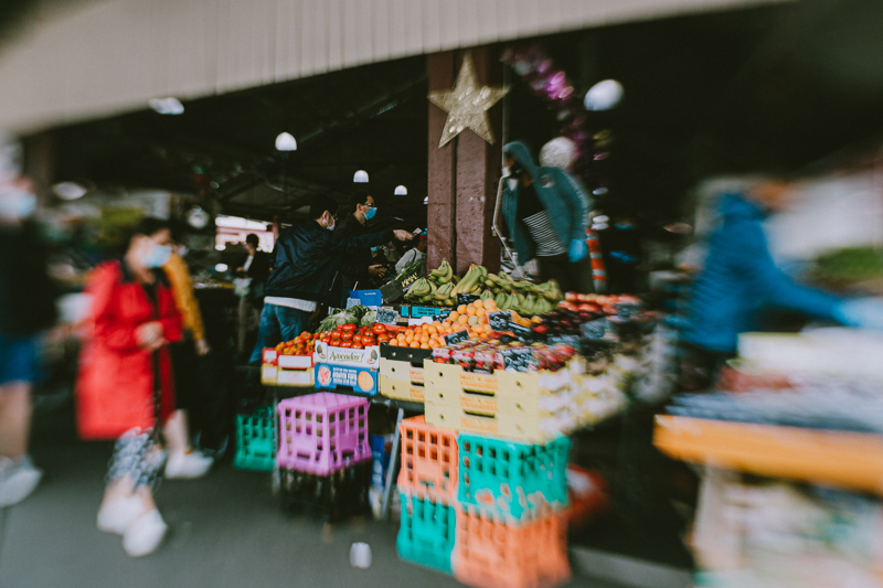
A lot of street photography is about waiting. You’ll increase your shot rate if instead of wandering around all day looking for great backdrops with interesting people in it to shoot, simply find a great spot then wait. Look for anything that would make a great frame, or interesting signage, a beautifully textured brick wall or mural… then wait for someone interesting to walk into the frame.
I was attracted to the colour and repetition in this display of fruit and veg at the Victoria Market in Melbourne. But I also wanted to add another layer of colourful movement at the edges, so waiting for someone to walk into the frame was the ideal way to include those elements. But this is Melbourne – we’re known for our love of wearing black1 So it took a lot of time and a lot of patience. And when the beautifully red coated lady came along you can imagine how excited I was!
Pam Bradford, CLG Instructor
I hope you enjoyed this focus on B&W street photography, which doubled as a quick and easy beginner’s guide!
Join my new workshop and learn How to Shoot Pro-Quality Photos With Your DSLR… and it’s totally FREE to join! Register here…

Leave a Reply Cancel reply
PRIVACY POLICY & SITE TERMS AND CONDITONS
CLICK LOVE GROW ™ Pty Ltd - COPYRIGHT 2024 ©
x
Join Now
Enter your info below to join the challenge!
Want a friendly reminder when I go live?
Pop in your number and I’ll shoot you a text.
* We will send text reminders for our live calls during the challenge! Reply ‘STOP’ to end or ‘HELP’ for help.
We promise not to ever share your details with anyone or send you spam! Check our privacy policy and terms of service.
Be the first to comment