


A 30 Day Colour Project
Exciting news… Emma Davis is back with a brand new Creative Workshop!
And we’ll know you’ll love this one because it’s going to give you a reason to pick up your camera every day for a month!
It’s called 30 Days of Colour and it’s a photo-a-day project with a focus on colour and exploration.
If that sounds like something you’d be interested in, check out this free class with Emma where she gives you an inside look into the workshop and what it will do for your photography mojo! Click here to watch the free class.
The Power of Colour
The use of colour in photography is one of the easiest ways to create really strong, visually powerful imagery. Whether you’re simply giving your images a saturation boost in editing to enhance the colour already in the scene, or the colour is the subject within itself… it’s a compositional tool that grabs your viewer’s attention immediately!
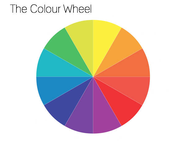
In this creative tutorial we explore complementary colours – those opposite one another on the colour wheel – which are a guaranteed recipe for a great photo!
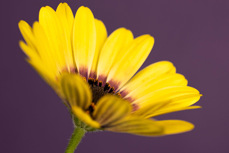
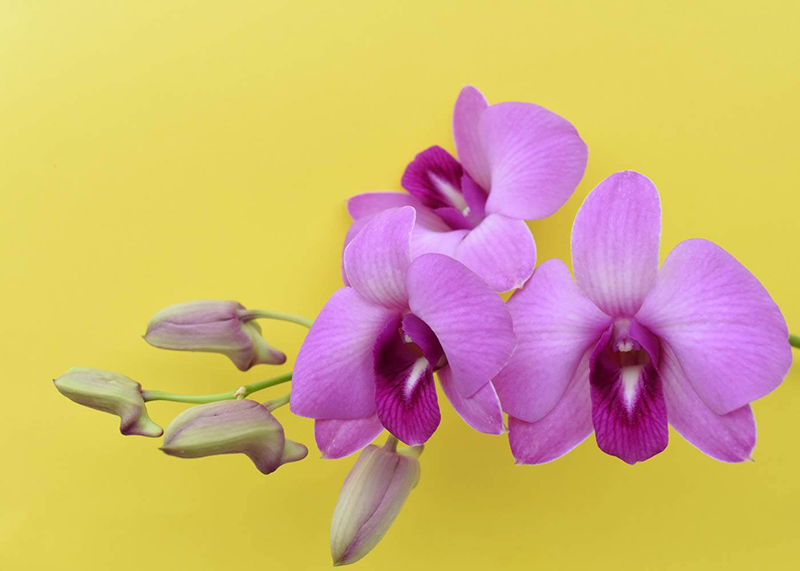
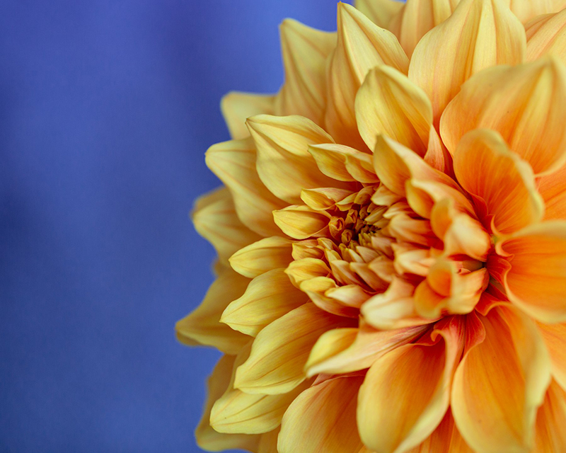
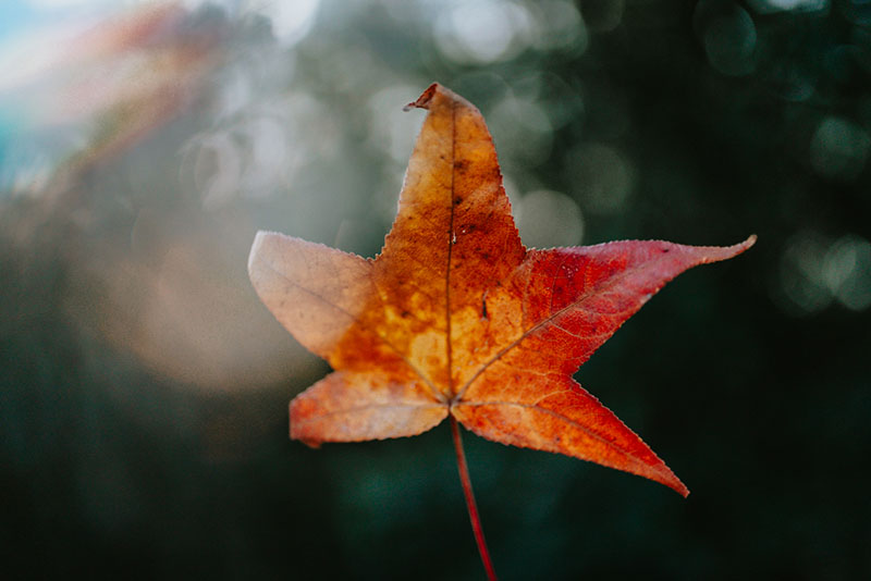
1. Complementary Colour in Nature
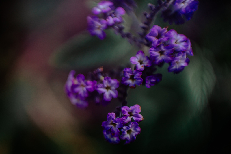
Once you start looking for complementary colours in nature, you’ll see it everywhere! Mother Nature really knew colour theory… these shots are perfect examples where she’s used complementary colour.
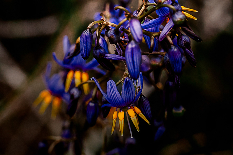
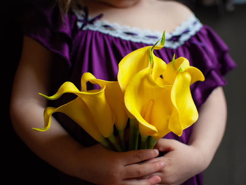
Emma Davis, CLG Instructor – purple & yellow
Emma Davis, CLG Instructor – blue & yellow
Emma Davis, CLG Instructor – purple & green
2. Food
Once again Mother Nature uses colour in whole foods, perhaps to entice us to eat? Regardless, it’s an easy way to create a fabulous image!
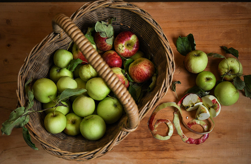
Lindy Zolnierczak – red and green
Take matters into your own hands and and grab two different foods in complementary colours to set up a striking image. Get in close, fill the frame!
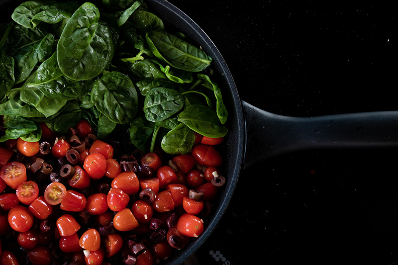
Melissa Kaufman, CLG Grad – red & green
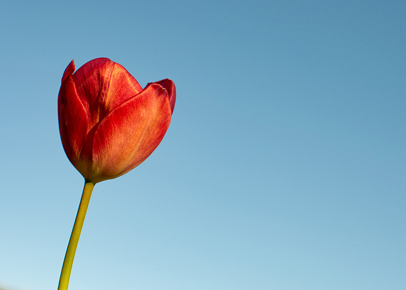
3. Sky as Backdrop
Look for opportunities to use the sky as a contrasting backdrop, get down low and shoot up.

Emma Davis, CLG Instructor – blue & yellow
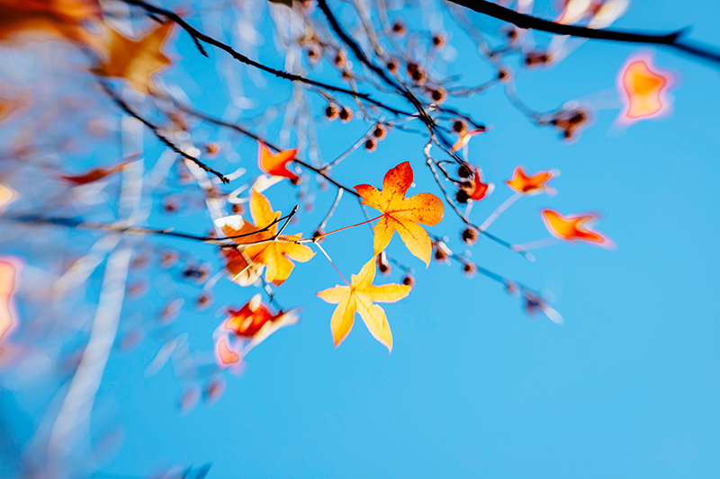
Emma Davis, CLG Instructor – blue & orange
Claire Roads, CLG Grad – blue & red
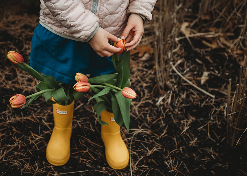
4. Clothing
Clothing is a really easy way to use complementary colours simply by choosing a tone that is opposite on the colour wheel to the other elements you plan to include.
Jennifer Magnuson – yellow & purple
Julie Arace – orange/yellow with blue/green
Jypsie Cronan, CLG Grad – orange & green
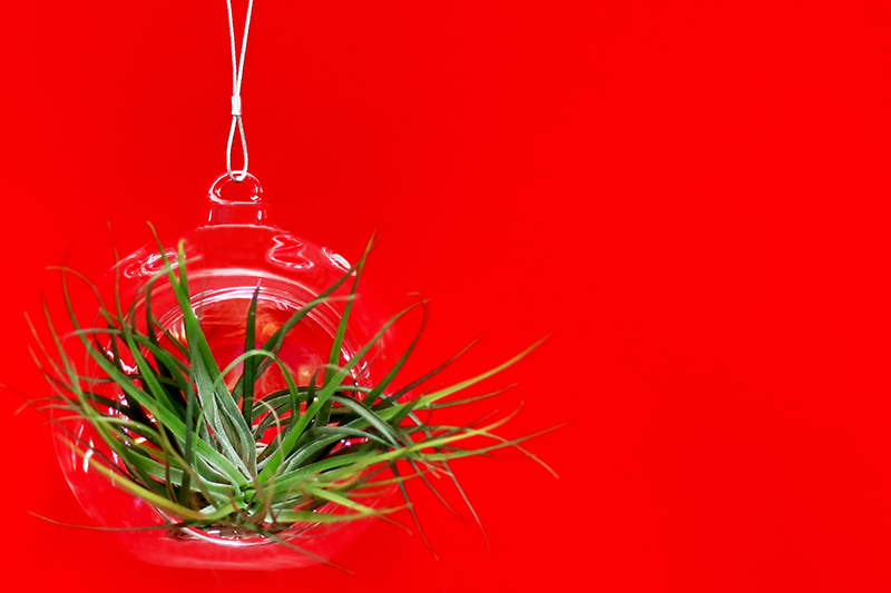
5. Block Coloured Background
The options are limitless when you use a block coloured background for your subject. Seek out objects against coloured walls, or place objects against a coloured wall. alternatively, a sheet of simple project paper makes a super inexpensive, super effective shot!
Janey Peters, CLG Grad – purple & yellow
Milo Merlot, CLG Grad – red & green

Anna Shum, CLG Grad – green & pink

Morvern Shaw, CLG Grad – green & orange
Ailsa Sye, CLG Grad – pink & yellow
Jypsie Cronan, CLG Grad – pink & green
Angela McIntyre, CLG Grad – blue & yellow
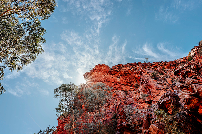
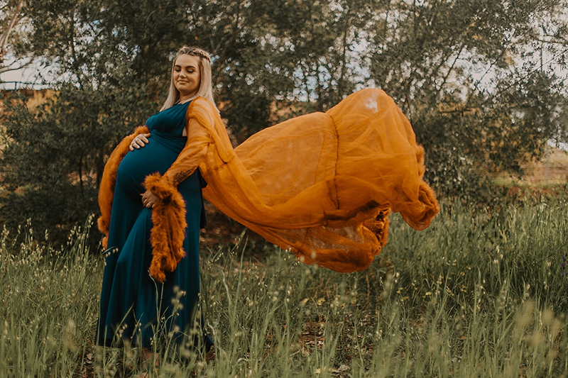
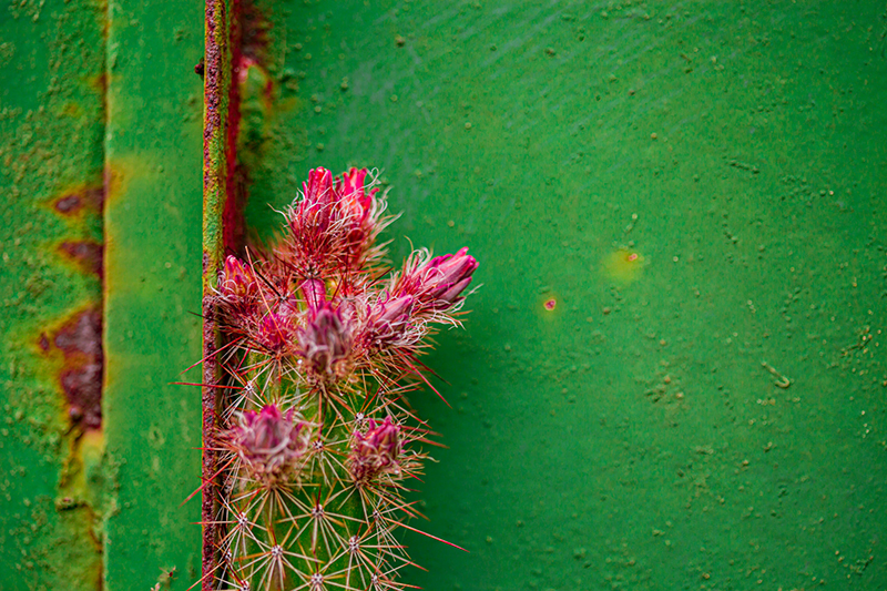
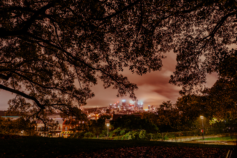
6. Colour in the Environment
Look for colour in the environment around you – including man-made objects – to create stunning landscapes, seascapes or cityscape images.
Related: Getting Started in Landscape Photography
Emma Davis, CLG Instructor – pink & green
A sunset can provide a natural display of complementary colour to use as a backdrop for a stunning silhouette. Silhouette shots work best when the subject has good form and detail so that you can clearly tell what it is even in shadow.
Related: How to Take Perfect Silhouette Photos
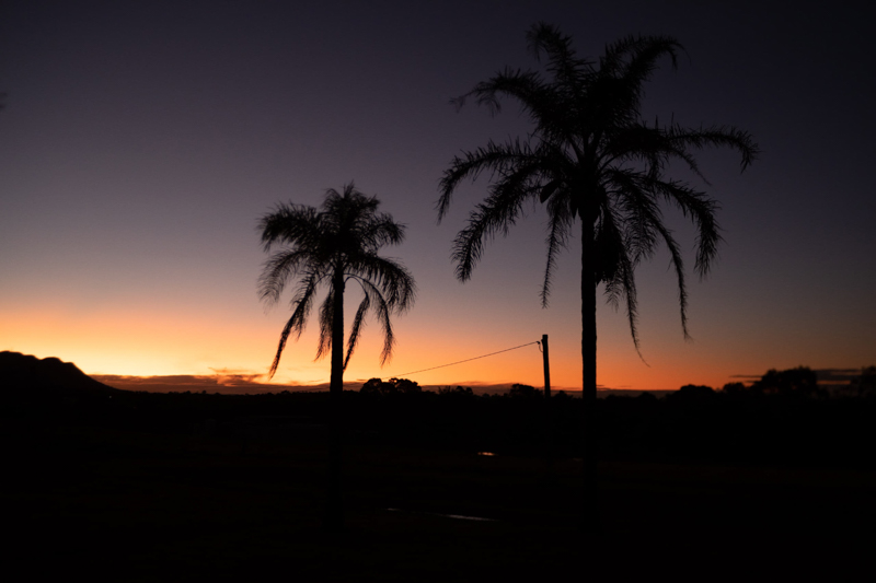
Emma Davis, CLG Instructor – purple & orange
With so much green in the environment, it’s easy to use it as a backdrop for something in a complementary colour of red, pink or orange.
Emma Davis, CLG Instructor – green & orange/red
We hope these images inspire you to start viewing your world with a fresh eyes, and using colour to elevate your photos!
FREE ONLINE CLASS: Exploring 30 Days of Colour
If it’s something you’d love to explore more, watch my FREE CLASS with Emma Davis (the QUEEN of colour!).
It’s an inside look into her new workshop, which is a photo-a-day project with a focus on colour and exploration.
Click HERE to watch the free class!
")
Leave a Reply

PRIVACY POLICY & SITE TERMS AND CONDITONS
CLICK LOVE GROW ™ Pty Ltd - COPYRIGHT 2024 ©
x
Join Now
Enter your info below to join the challenge!
Want a friendly reminder when I go live?
Pop in your number and I’ll shoot you a text.
* We will send text reminders for our live calls during the challenge! Reply ‘STOP’ to end or ‘HELP’ for help.
We promise not to ever share your details with anyone or send you spam! Check our privacy policy and terms of service.
Be the first to comment